Larkfield Tutors is a made-up booking app that FluxForge built for its samples. Of the fourteen accessibility faults fixed here, six were planted on purpose, two more were found by the audit, and six were found during the fixing work.
FluxForge wrote the audit, in the style of an independent auditor's report, and made the fixes with Claude Code, an AI coding agent it directed. No independent auditor has examined this app. On a real product, the independent auditor decides whether it meets the standard.
What was fixed
Fourteen faults: the audit's eight findings, two more found by the automated checker, and four more found during the work, which the checker cannot see.
The automated checker
Before the fixes it failed 6 rules across the screens tested; after them, none. It cannot see nine of the fourteen faults, so a clean result does not mean the app meets WCAG.
Checked by a person
FluxForge's founder, who owns the app, followed a 24-step script with one screen reader and ticked every step. That is one pass by the owner, not an independent audit.
Left for an auditor
Three faults that were seen and left alone, other screen readers and browsers, and a full check of every screen by hand.
How to read this
Who did what. FluxForge built Larkfield Tutors as a demonstration app; every person, child, booking and file in it is made up. The audit is FluxForge's own sample audit of the app. Six of its eight accessibility findings were faults planted on purpose, which the audit confirmed; the other two it found itself. FluxForge then fixed all eight, and six more faults found along the way, with Claude Code, an AI coding agent it directed. FluxForge's founder, who owns the app, ran the screen-reader check. No independent auditor has examined the app.
Before and after. «Before» is the app exactly as audited. «After» is the same app with the 13 commits of fixes. A commit is one saved, numbered change to the code.
The pictures are 1280 × 800 pixels. The dark strip marked TEST NOTE along one edge was added by the test script and is not part of the app. It reports what the script read from the page at that moment, such as which element had keyboard focus. Several of these faults cannot be seen in a picture, so the note carries the evidence, and each caption says what the notes report.
The test account. Signed-in screens were tested as a parent test account, called Parent A here. The script replaced Parent A's email address and name inside the page before recording anything. Every other name is the app's made-up sample data. «Sample Parent», «Sample Child» and similar values, a made-up address among them, were typed into forms by the script and never saved.
Almost nothing was saved. The script blocked every request that would store data. The one exception was made on purpose: a single real booking, to test where focus goes after a real save. Pictures taken after it list two lessons; those taken before it list one. The limits at the end of this page describe it.
Words used.
A diff lists the changed lines of code: a line marked «-» was removed, a line marked «+» was added.
A screen reader reads the page aloud for people who cannot see it.
Focus is the place on the page that the keyboard currently acts on.
axe-core is a widely used automated accessibility checker.
The page background is one colour that appears here under two codes. The browser paints it as #fcfaf4, which is what the measurements on screen read; worked out from the app's colour settings, the same colour rounds to #fdfaf4, because its red part falls almost exactly between two steps.
The findings
Written in the style of an independent auditor's report. F5 to F19 and their severities are the audit's. E1 to E6 are extra: E1 and E2 were found by axe-core, and E3 to E6 were found during the work.
F5 Keyboard trap in the booking date and time fields
Audit report
F5, High
WCAG 2.1
2.1.2 No Keyboard Trap (Level A)
Where
Parent dashboard, "Book a lesson" form, the Date and Time fields. src/components/views/parent-view.tsx, lines 189 and 264–278 at b8e5539
What fails
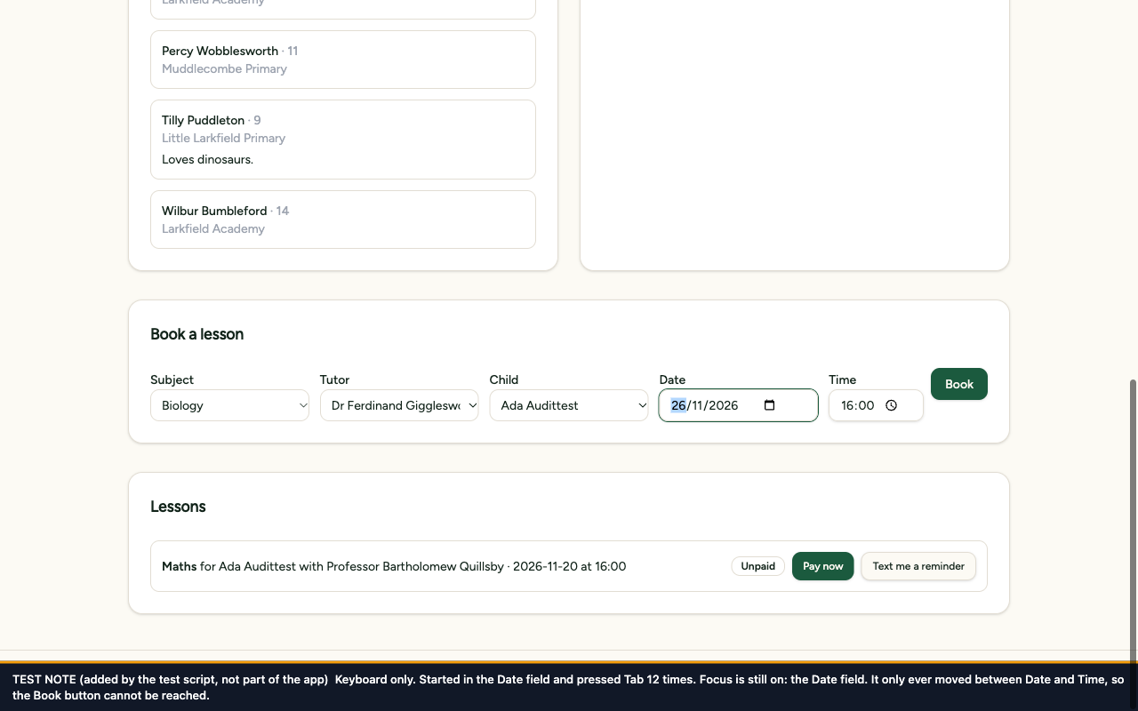
Once keyboard focus is in the Date field, Tab and Shift+Tab only swap between Date and Time, and Escape is swallowed. Measured before the fix: starting in the Date field, 12 presses of Tab only ever moved focus between the Time field and the Date field.
What it means for a user
Someone who uses a keyboard and not a mouse, for example because of a tremor or because they are blind, cannot reach the Book button, so they cannot book a lesson. They cannot leave the form either without reloading the page.
3.3.2 Labels or Instructions (Level A) and 1.3.1 Info and Relationships (Level A)
Where
Sign-up form (the "Parent sign up" tab of /auth): Your name, Email, Password. src/routes/auth.tsx, lines 90–102. "Add a child" form on the parent dashboard: Name, Age, School, Notes. src/components/views/parent-view.tsx, lines 141–145
What fails
None of the seven fields has a label. Each shows only a grey hint inside the field, and the hint disappears as soon as anything is typed. axe-core does not report this fault, because it accepts a hint as a field's name.
What it means for a user
Anyone who looks away and back, or checks the form before sending it, can no longer see which field is which. People with memory or attention difficulties are hit hardest. Screen-reader and voice-control users get no dependable name for the field.
F12 Booking form labels are not linked to their fields
Audit report
F12, Medium
WCAG 2.1
1.3.1 Info and Relationships (Level A) and 4.1.2 Name, Role, Value (Level A)
Where
Parent dashboard, "Book a lesson" form: Subject, Tutor, Child, Date, Time. src/components/views/parent-view.tsx, lines 173–192 and 280–282
What fails
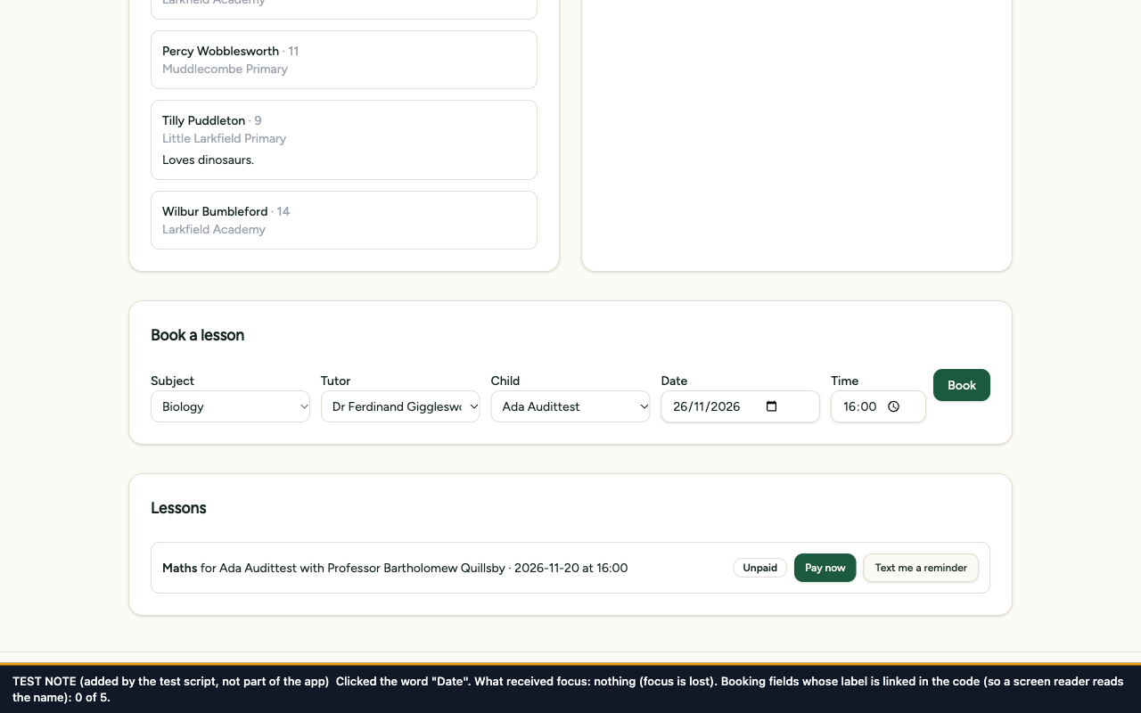
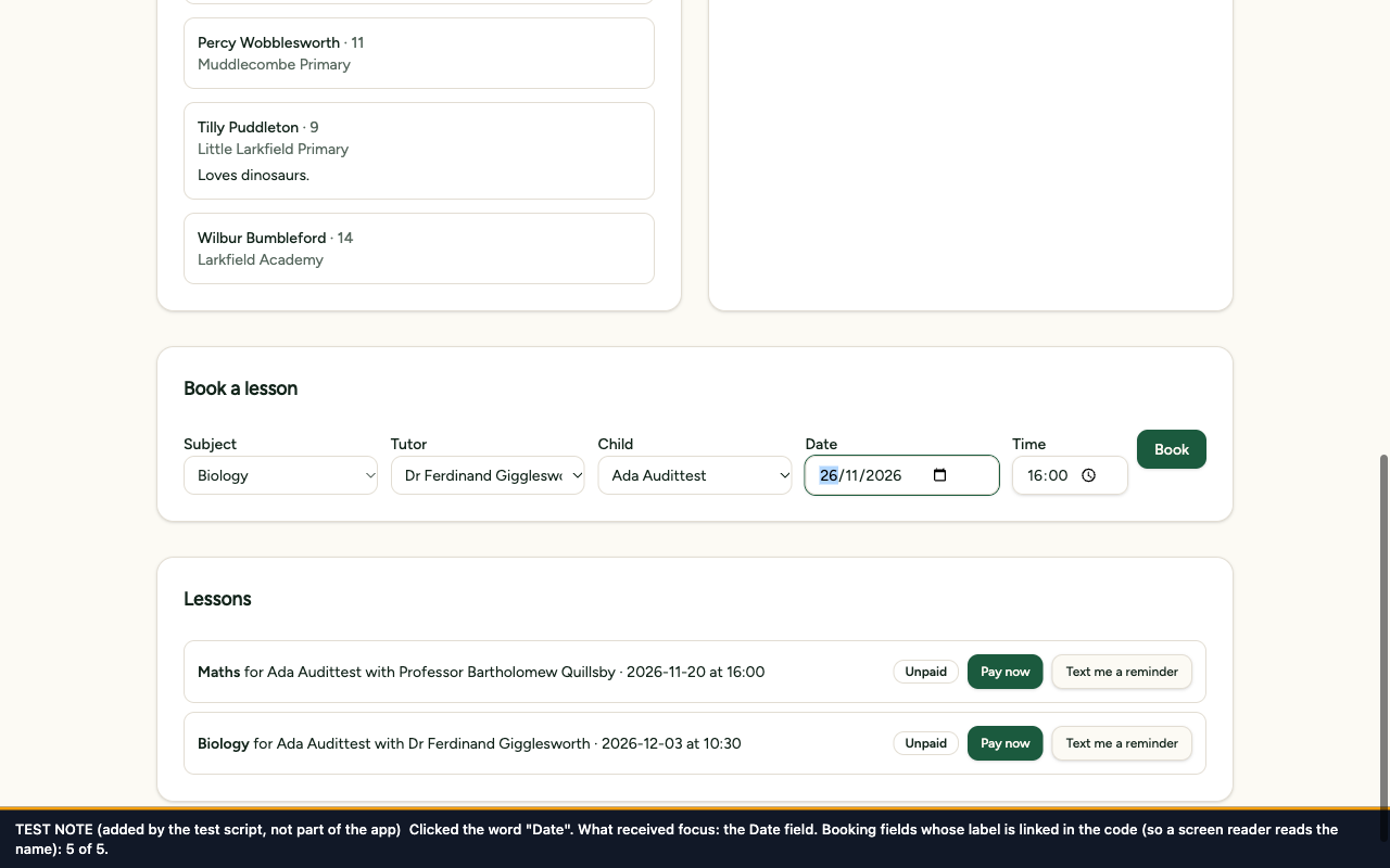
The five names are printed above the fields, but none is linked to its field in the code, so the fields have no name of their own. Measured before the fix: 0 of 5 labels linked.
What it means for a user
A screen reader announces five unnamed controls in a row, so a blind user has to guess which is which. Clicking a name does not move the cursor into its field, which leaves a smaller target for people with limited hand control.
The colour setting for helper text, --muted-foreground in src/styles.css, line 92, used on every screen. Also the subject tags in the tutor directory, src/routes/tutors.tsx, line 80
What fails
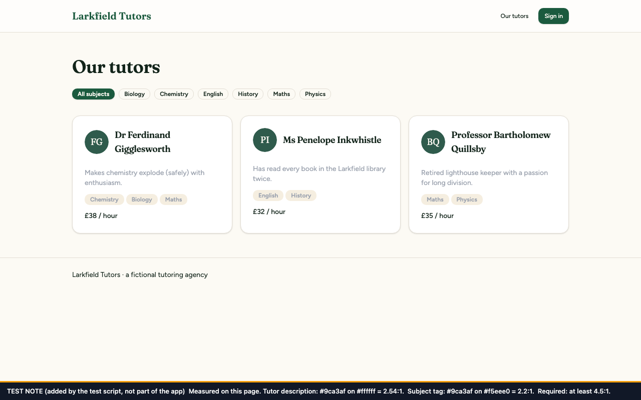
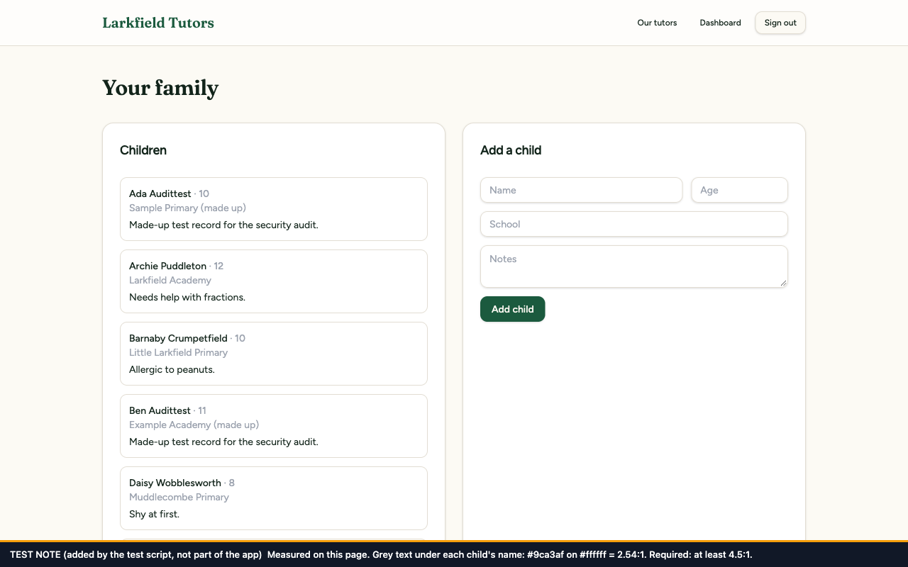
Helper text and subject tags are light grey, #9ca3af. Measured on the live pages before the fix, as text colour on background colour: tutor descriptions #9ca3af on #ffffff = 2.54:1; subject tags #9ca3af on #f5eee0 = 2.20:1; the line under each child's name #9ca3af on #ffffff = 2.54:1; the unselected tab on the sign-up page #9ca3af on #f4f0e7 = 2.23:1. The minimum for text of this size is 4.5:1.
What it means for a user
People with low vision, and anyone using a dim screen or a screen in sunlight, struggle to read tutor descriptions, subject tags, children's schools and other secondary text.
F14 Focus jumps to the footer when the booking dialog closes
Audit report
F14, Medium
WCAG 2.1
2.4.3 Focus Order (Level A)
Where
Parent dashboard, the "Confirm your booking" dialog. src/components/views/parent-view.tsx, lines 203–207
What fails
When the dialog closes, keyboard focus is sent to the page footer. Measured before the fix: after Cancel, focus was on the page footer; after Escape, on the page footer; after Confirm booking, on the page footer.
What it means for a user
After confirming or cancelling, a keyboard user is dropped at the very bottom of the page and has to work back up through the whole lessons list to reach the form again. A screen-reader user is given no clue where they have landed.
Tutor directory (/tutors), the row of subject filters. src/routes/tutors.tsx, lines 57–64
What fails
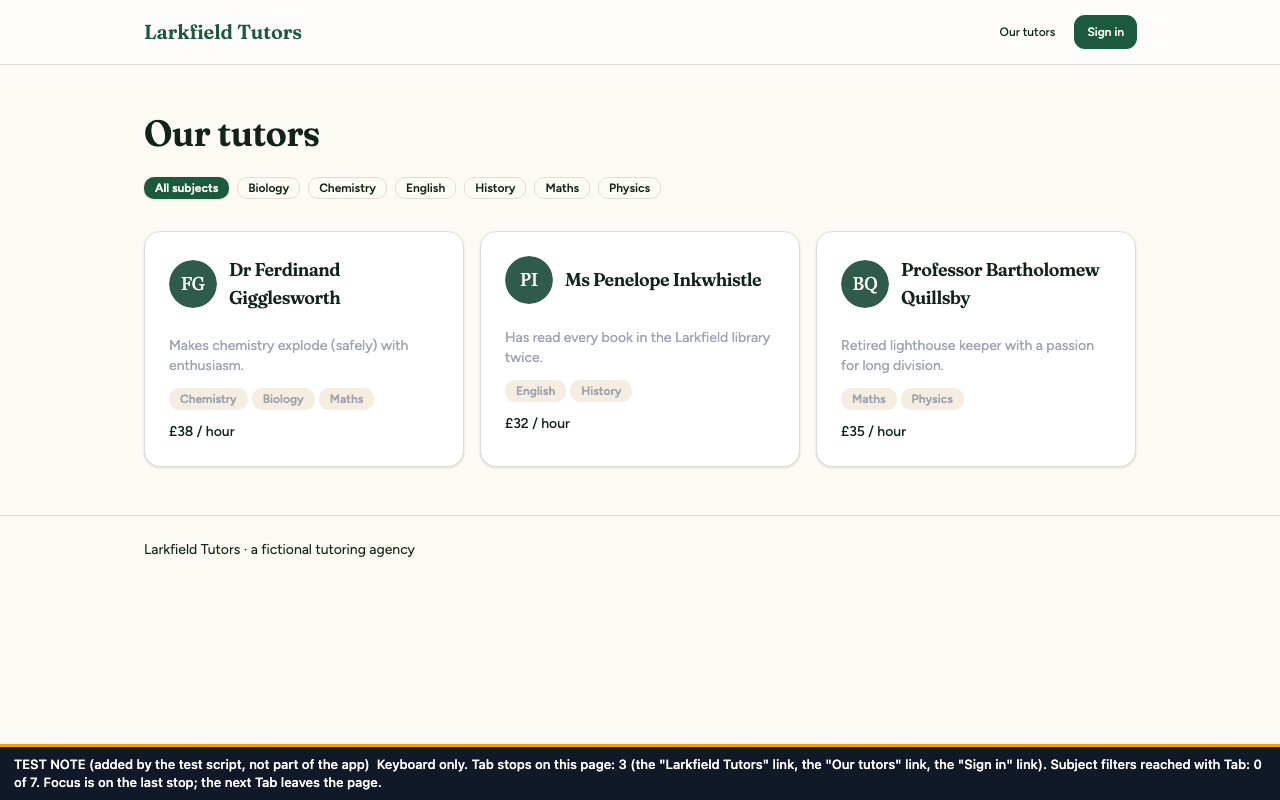
The 7 filters ("All subjects" and one for each subject) are plain blocks that react only to a mouse click. Tab skips them: measured before the fix, the page had 3 Tab stops, all of them links in the header. The filters also do not say that they are buttons, or which one is switched on.
What it means for a user
Keyboard users, which includes screen-reader users, cannot filter the directory by subject at all.
Not in the audit. Found by axe-core, rule page-has-heading-one, which axe rates "moderate"
WCAG 2.1
1.3.1 Info and Relationships (Level A). axe-core files this rule under "best practice", not under a WCAG criterion. 1.3.1 is the criterion that applies here, because text that looks like a heading is not marked up as one
Where
Sign-in and sign-up page (/auth), the title "Welcome to Larkfield". src/routes/auth.tsx, line 76
What fails
The title is drawn in large type but is a plain block of text in the code. The page has no heading at all.
What it means for a user
Screen-reader users commonly move around a page by its headings and expect a main heading that says what the page is. On this page the list of headings is empty.
E3 The focus ring on solid green buttons cannot be seen
Audit report
Not in the audit, and axe-core does not report it. Noticed in the screenshots taken for F14 and F16, then measured
WCAG 2.1
2.4.7 Focus Visible (Level AA). WCAG 2.1 sets no minimum contrast between a focus ring and the button it surrounds; the 3:1 used in the test is borrowed from 1.4.11 Non-text Contrast (Level AA), which asks it of a ring against the background behind it.
Where
Every solid green button: "Sign in" in the header, "Create account", "Add child", "Book", "Confirm booking" and "Pay now". The shared button, src/components/ui/button.tsx, line 8
What fails
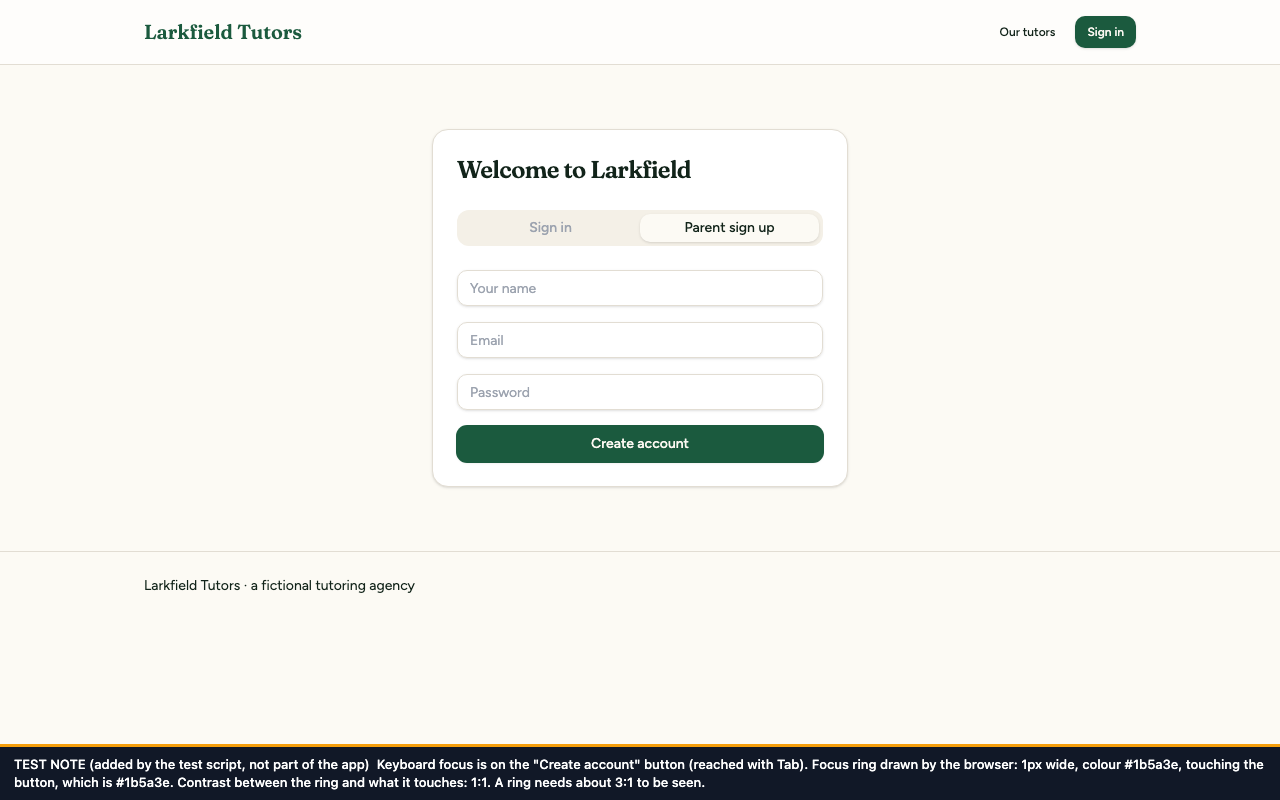
The ring that marks keyboard focus is 1 pixel wide, in the same green as the button, and touches it. Measured before the fix on "Create account": ring #1b5a3e against a #1b5a3e button, contrast 1.00:1. All that changes is that the button gets a hair bigger.
What it means for a user
A sighted person using the keyboard cannot tell when focus is on one of the app's main action buttons, so they cannot tell what pressing Enter will do.
E4 Card titles look like headings but are not headings
Audit report
Not in the audit, and axe-core does not report it, because each page does have a main heading. Noticed while fixing E2, then measured
WCAG 2.1
1.3.1 Info and Relationships (Level A)
Where
Parent dashboard: "Children", "Add a child", "Book a lesson", "Lessons". Tutor directory: each tutor's name. The shared card title, src/components/ui/card.tsx, lines 23–32
What fails
The titles are drawn as headings but are plain blocks in the code. Measured before the fix: the dashboard had 1 heading and the tutor directory had 1, in each case only the page title.
What it means for a user
A screen-reader user who lists a page's headings to get an overview, or jumps from heading to heading, finds one heading and nothing else. They have to read through everything to find the booking form or one particular tutor.
Not in the audit, and axe-core does not report it. Noticed while adding the labels for F11
WCAG 2.1
1.3.5 Identify Input Purpose (Level AA)
Where
Sign-up and sign-in forms on /auth: Your name, Email, Password. src/routes/auth.tsx, lines 90–102
What fails
None of the three fields carries the hint, called "autocomplete" in the code, that tells a browser what kind of detail the field asks for. Measured before the fix: 0 of 3 fields had one.
What it means for a user
Browsers and password managers cannot fill the fields in dependably, so people who find typing hard, or who struggle to remember their details, have to type everything by hand. Tools that add a familiar icon to each kind of field have nothing to go on.
Not in the audit, and axe-core does not report it. Noticed while writing the re-test script, then measured
WCAG 2.1
3.3.1 Error Identification (Level A)
Where
Parent dashboard, "Book a lesson": the message under the form. src/components/views/parent-view.tsx, lines 19–23. Sign-up and sign-in (/auth): the messages for an email address or password that is too long. src/routes/auth.tsx, lines 24–28
What fails
The booking form gives the same message whichever field is empty. Measured before the fix with only Time empty: "Please fill in every field". On sign-up, an email address longer than the 255 characters the app accepts gave "String must contain at most 255 character(s)", which names no field. "Invalid email" does name its field and was not at fault.
What it means for a user
The user is told that something is wrong but not where. Someone who cannot take in the form at a glance, such as a screen-reader user or someone using high magnification, has to go back through every field to find the one to fix.
Faults are grouped by the piece of the app that causes them, so that one repair covers every screen that piece appears on. Each row is one commit.
The fix plan: thirteen fixes, by component
#
Component
Findings
Screens it affects
The fix
Price
Commit
1
Form field (a field and its label as one piece): new shared component src/components/form-field.tsx, used by src/routes/auth.tsx and src/components/views/parent-view.tsx
The message names the field that is empty or too long, by the name printed on the form.
US$65
fbe5901
—
Total
8 audit findings + 6 extra
—
—
US$590
—
This demo has 13 fixes for 14 faults. A real product's audit is usually many times larger, which is why remediation typically costs US$15,000–25,000.
Fixes 1 to 7 are the audit's findings, at the audit's prices. Fixes 8 to 13 were found during the work; on a client's product each would be priced separately before work on it started. Their prices here were worked out afterwards, on the same basis.
Before and after, fix by fix
One entry for each commit: what changed, the commit, the code change, the test, and the pictures. The «after» pictures were taken on the final code, so each one also shows the other fixes; the one exception is the picture of the real booking, taken one fix earlier.
Fix 1 Form field (a field and its label as one piece)
A new shared building block, FormField, prints a field's name above it and links the name to the field in the code. The sign-up, sign-in, add-a-child and booking forms all use it, so every field in them gets its label the same way. The grey hints inside the sign-up and add-a-child fields are gone, because the labels that stay on screen replace them.
The code change
--- /dev/null
+++ b/src/components/form-field.tsx
@@ -0,0 +1,28 @@
+added import { cloneElement, useId, type ReactElement } from "react";
+added
+added import { Label } from "@/components/ui/label";
+added import { cn } from "@/lib/utils";
+added
+added /**
+added * A form control with a visible label that is linked to it in the code.
+added * The name stays on screen while someone types, screen readers and voice control
+added * read it out, and clicking the label moves focus to the control.
+added */
+added export function FormField({
+added label,
+added className,
+added children,
+added }: {
+added label: string;
+added className?: string;
+added children: ReactElement<{ id?: string }>;
+added }) {
+added const generatedId = useId();
+added const id = children.props.id ?? generatedId;
Not shown: 5 more hunks of this commit, in src/components/views/parent-view.tsx and src/routes/auth.tsx.
The test
src/test/a11y/form-labels.test.tsx, 3 tests. For each of the twelve fields (three on sign-up, four on add a child, five on book a lesson) it looks the field up by the name a user sees, which only works if a visible label is linked to it.
Before the fix: 3 of 3 failed. Sign-up and add a child: "Unable to find a label with the text of: Your name" (and "Name"). Booking: "Found a label with the text of: Subject, however no form control was found associated to that label."
After the fix: 3 of 3 passed.
Before and after
Before
After
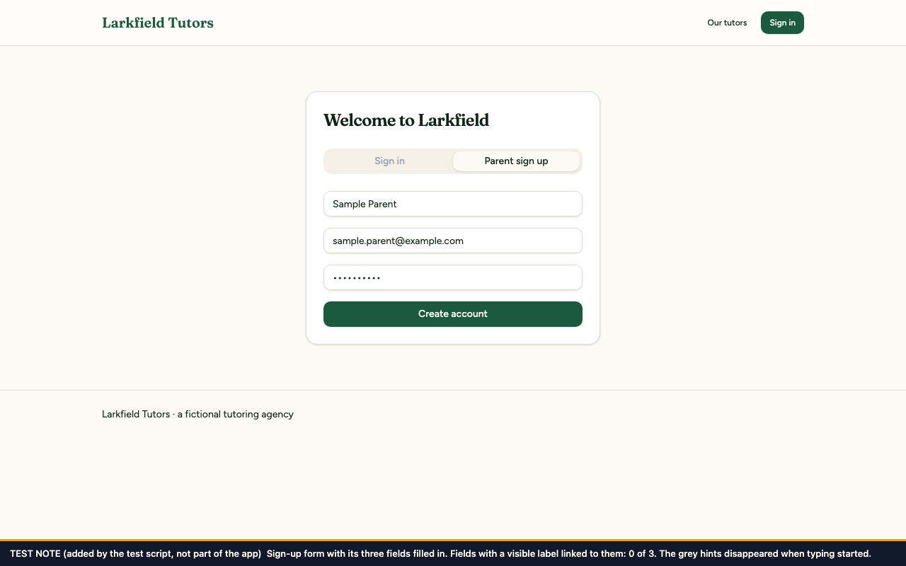
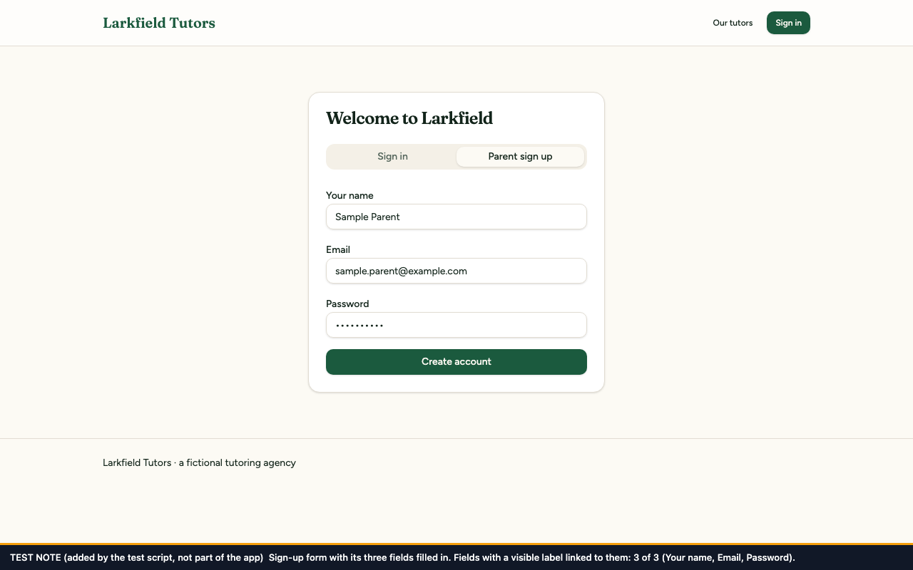
Before, the three filled-in fields give no clue which is which (0 of 3 have a label); after, each has its name printed above it (3 of 3: Your name, Email, Password).
Before
After
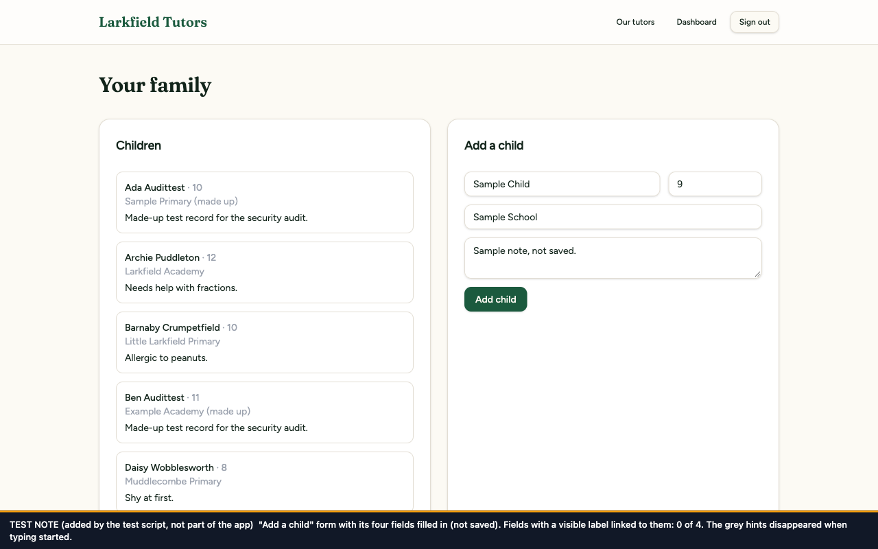
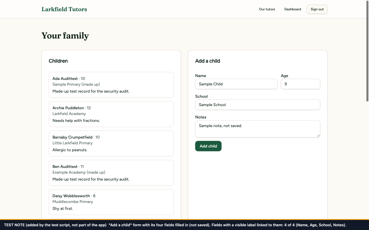
Before, the four filled-in fields of "Add a child" are unnamed (0 of 4); after, Name, Age, School, Notes are printed above them (4 of 4).
Before
After
The form looks almost the same in both; what differs is what happened after clicking the word "Date". Before, focus went to nothing (focus is lost) and 0 of 5 labels were linked; after, focus went to the Date field and 5 of 5 are linked.
A new shared building block, FormError, shows the red error text and marks it as an alert. Screen readers read an alert out the moment it appears, without the user having to go and find it. Each form also puts up a fresh alert on every attempt, so making the same mistake twice is announced twice.
The code change
--- /dev/null
+++ b/src/components/form-error.tsx
@@ -0,0 +1,15 @@
+added import type { ReactNode } from "react";
+added
+added import { cn } from "@/lib/utils";
+added
+added /**
+added * An error message for a form. role="alert" makes screen readers announce it as soon as it
+added * appears. Give it a new `key` on every submit so a repeated mistake is announced again.
+added */
+added export function FormError({ className, children }: { className?: string; children: ReactNode }) {
Not shown: 7 more hunks of this commit, in src/components/views/parent-view.tsx and src/routes/auth.tsx.
The test
src/test/a11y/form-errors.test.tsx, 3 tests. It submits the sign-up form with a bad email address and the booking form empty, and checks that the error appears as an alert. A third test submits each form twice and checks a new alert is put up the second time.
Before the fix: 3 of 3 failed: "Unable to find role='alert'".
After the fix: 3 of 3 passed.
Before and after
Before
After
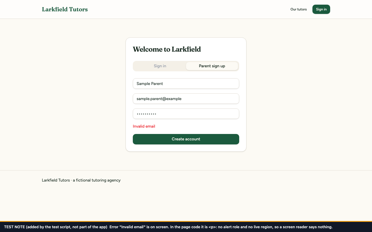
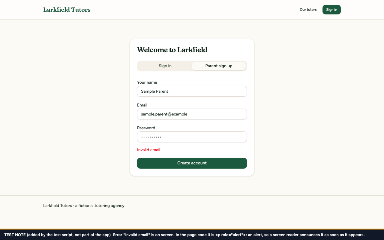
The red "Invalid email" text looks the same in both; the note shows what it is in the code: before, a plain <p> with no alert role; after, <p role="alert">. (The after picture also shows the field labels from fix 1.)
Before
After
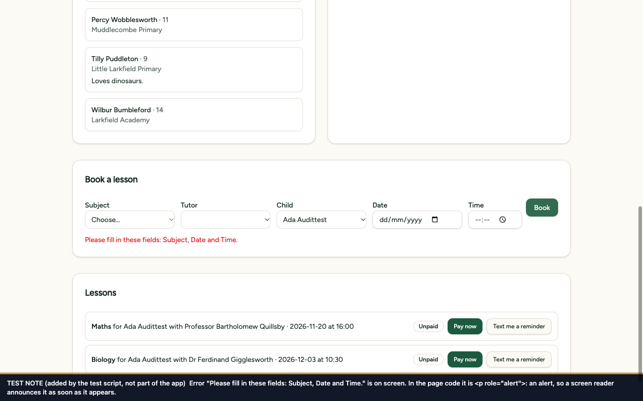
The red error text sits in the same place in both. Its wording differs because the «after» picture was taken on the final code, which includes fix 13. What this fix changed is in the code: before, a plain <p>; after, <p role="alert">, an alert.
The piece of code that caught Tab, Shift+Tab and Escape inside the date and time fields is deleted, together with the wrapper it was attached to. Nothing replaces it: the browser's own behaviour is the correct one.
The code change
--- a/src/components/views/parent-view.tsx
+++ b/src/components/views/parent-view.tsx
@@ -190,10 +190,8 @@ export function ParentView() {
src/test/a11y/booking-keyboard.test.tsx, 3 tests. It presses Tab, Shift+Tab and Escape in the Date and Time fields and checks that the page neither cancels the key press nor moves focus by itself, and that Escape reaches the rest of the page.
Before the fix: 3 of 3 failed: the page had cancelled each key press ("expected false to be true").
After the fix: 3 of 3 passed.
Before and after
Before
After
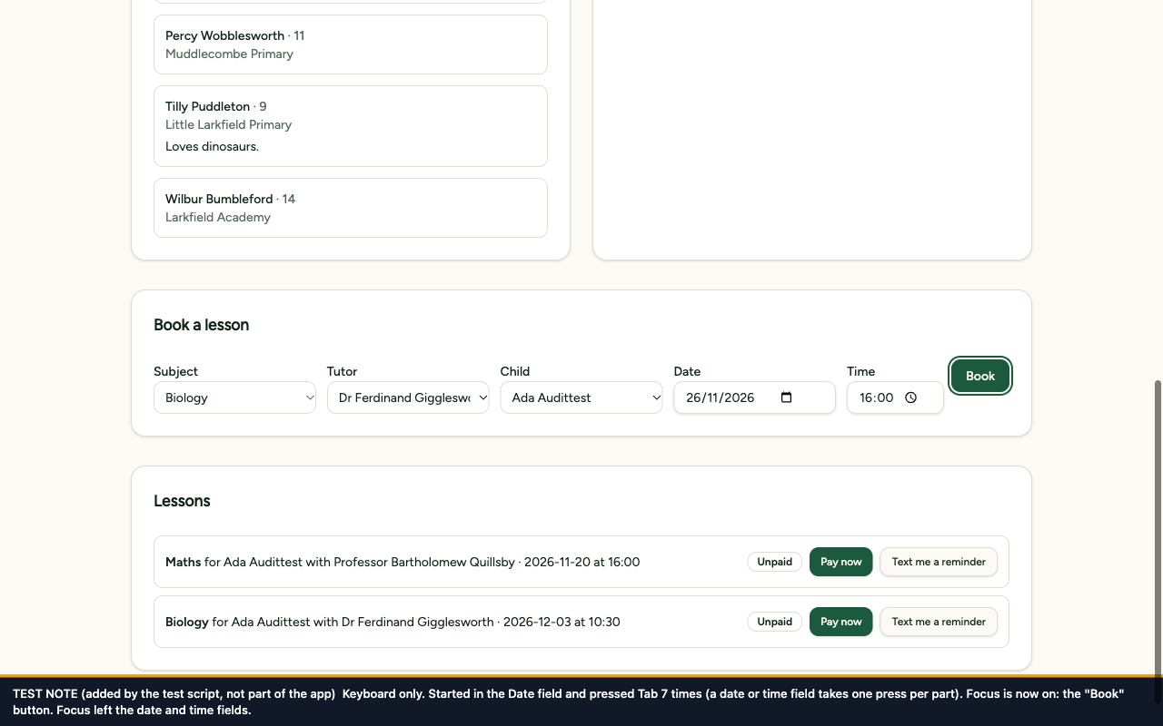
Before, after 12 presses of Tab starting in the Date field, focus is still on the Date field; after, 7 presses carry focus through the parts of the date and the time and on to the "Book" button.
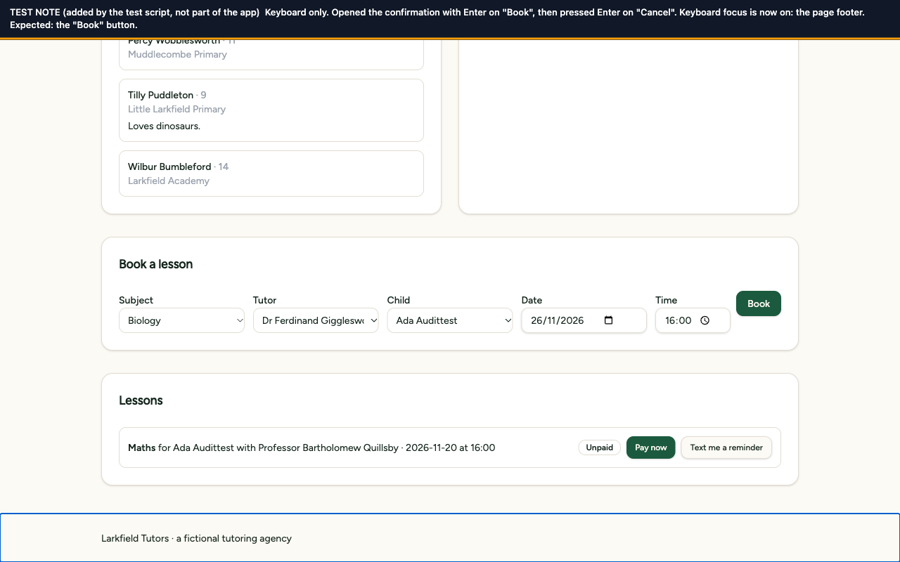
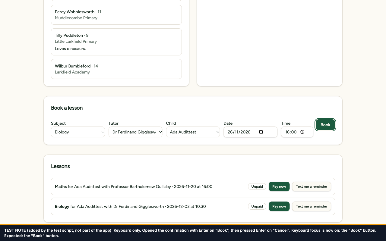
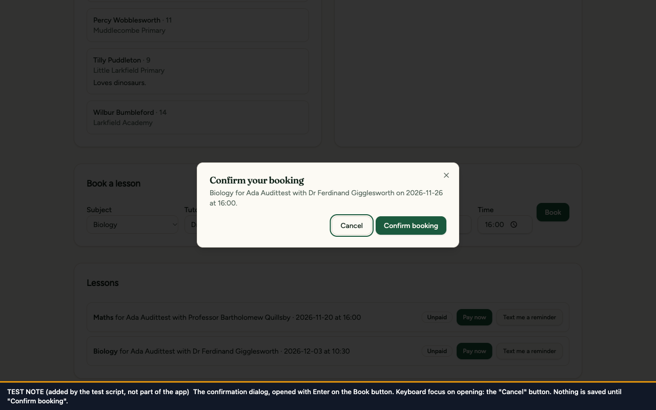
When the confirmation closes, the app now puts keyboard focus back on the Book button, whether it was closed with Cancel, Escape or Confirm booking. While a booking is being saved the Book button stays focusable (it is marked as unavailable instead of being switched off), and a second press is ignored until the save has finished. The page footer loses the two attributes that existed only so the planted fault could send focus there.
This differs from the audit's suggested fix. The audit said to delete the line that sent focus to the footer "so the dialog returns focus to the element that opened it". Tried in the browser, with only that line deleted, focus ended on nothing at all after Cancel and after Escape: this dialog is opened by the form, not by a dialog button, so the dialog has no opener to go back to. The fix therefore names the Book button.
The code change
--- a/src/components/views/parent-view.tsx
+++ b/src/components/views/parent-view.tsx
@@ -193,5 +195,14 @@ export function ParentView() {
Not shown: 4 more hunks of this commit, in src/components/views/parent-view.tsx and src/routes/__root.tsx.
The test
src/test/a11y/booking-dialog-focus.test.tsx, 4 tests. It opens the confirmation and closes it three ways (Cancel, Escape, Confirm booking with the save still running) and checks focus is on the Book button each time. A fourth test checks that pressing Book again during a save does not open a second confirmation.
Before the fix: 3 of 4 failed: focus was on <footer> instead of the Book button. The fourth passed before and after; it is there to guard against double bookings.
After the fix: 4 of 4 passed.
Before and after
Before
After
Before, the page has jumped to its bottom edge and focus is on the page footer; after, the view stays on the booking form and focus is on the "Book" button, with the ring from fix 10 drawn round it.
After
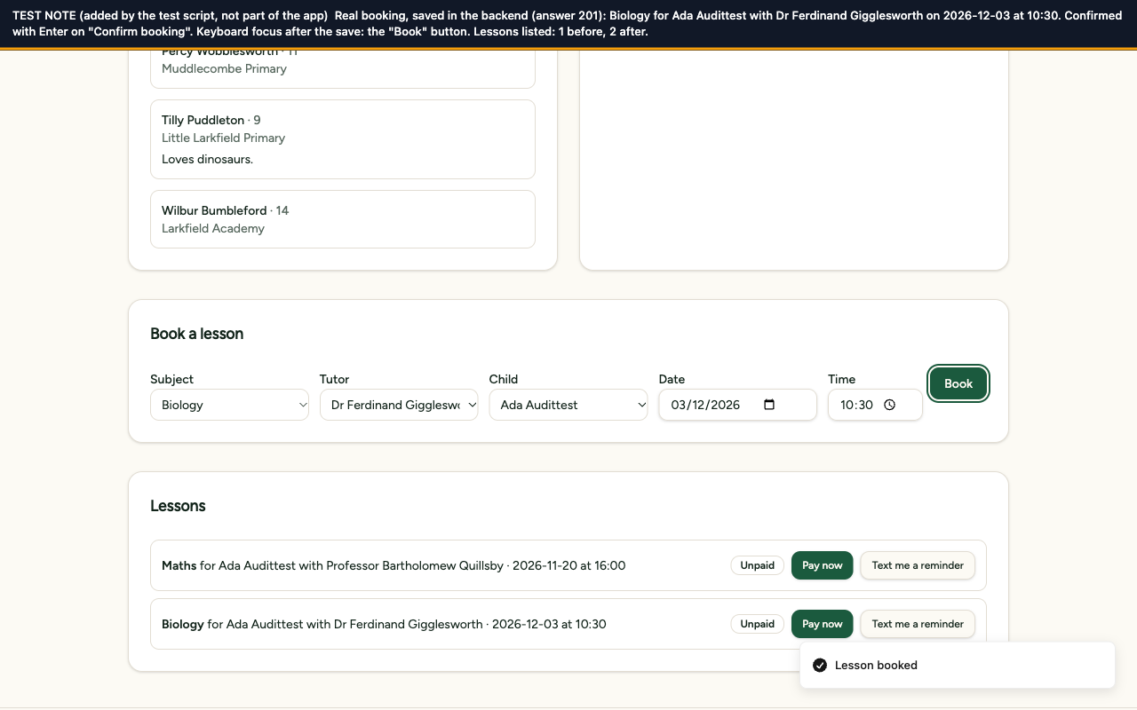
There is no "before" for this one, because only one real booking was made. It shows the page after that booking was really saved: the new lesson is in the list (1 lesson before, 2 after), the "Lesson booked" message is showing, and focus is on the "Book" button.
Before
After
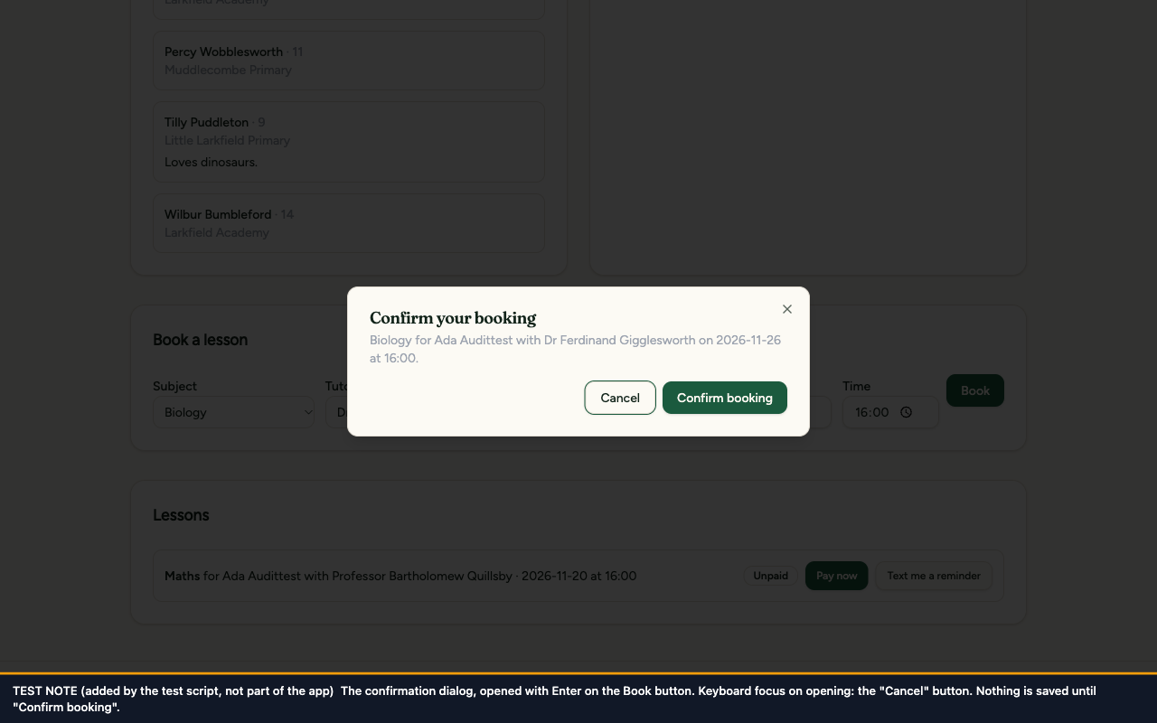
Context only: the dialog itself, opened from the keyboard. It is the same in both apart from its helper text, which is darker after fix 5, and the ring round Cancel, which is clearer after fix 10.
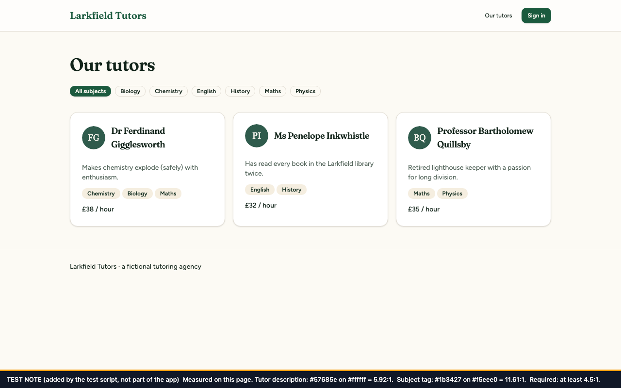
The colour used for helper text across the app changes from light grey #9ca3af back to the design's own grey-green, #57685e. The tutor directory's subject tags stop overriding their text colour, so they use the theme's dark green, #1b3427. The audit suggested #4B5563 as one possible colour; the design's original colour was used instead because it also passes and keeps the app's look.
-removed --muted-foreground: #9CA3AF; /* demo fault: low-contrast helper text */
+added --muted-foreground: oklch(0.5 0.025 160); /* at least 5.1:1 on background, card, muted and secondary */
--accent: oklch(0.88 0.08 75);
--accent-foreground: oklch(0.3 0.05 60);
The test
src/test/a11y/contrast.test.tsx, 6 tests. It reads the colours from the app's style sheet, works out the contrast of the helper-text colour against each of the four light backgrounds it can sit on, and requires at least 4.5:1. It also checks the subject tags use the theme's colours.
Before the fix: 5 of 6 failed: 2.44, 2.54, 2.23 and 2.20 against a required 4.5, and the tags' colour was overridden. The sixth test checks the test's own arithmetic and passes before and after.
After the fix: 6 of 6 passed.
Before and after
Before
After
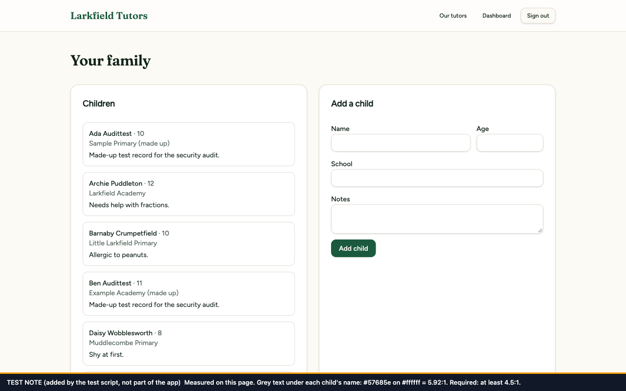
Before, the tutor descriptions and subject tags are pale grey (2.54:1 and 2.20:1); after, they are clearly readable (5.92:1 and 11.61:1).
Before
After
Before, the grey line under each child's name measures 2.54:1; after, 5.92:1.
Each subject filter is now a real button (a new shared building block, FilterChip) that also tells a screen reader whether it is switched on. The row of filters is named "Filter tutors by subject". They look as they did before.
The code change
--- /dev/null
+++ b/src/components/filter-chip.tsx
@@ -0,0 +1,27 @@
+added import type { ButtonHTMLAttributes } from "react";
+added
+added import { badgeVariants } from "@/components/ui/badge";
+added import { cn } from "@/lib/utils";
+added
+added /**
+added * A filter that is switched on or off. It is a real <button>, so it can be reached with Tab
+added * and worked with Enter or Space, and aria-pressed tells a screen reader whether it is on.
Not shown: 1 more hunk of this commit, in src/routes/tutors.tsx.
The test
src/test/a11y/tutor-filters.test.tsx, 3 tests. It checks every filter is a button in the Tab order, that the chosen filter reports itself as on and the list is filtered, and that the row has its name.
Before the fix: 3 of 3 failed: "Unable to find an accessible element with the role 'button' and name 'All subjects'".
After the fix: 3 of 3 passed.
Before and after
Before
After
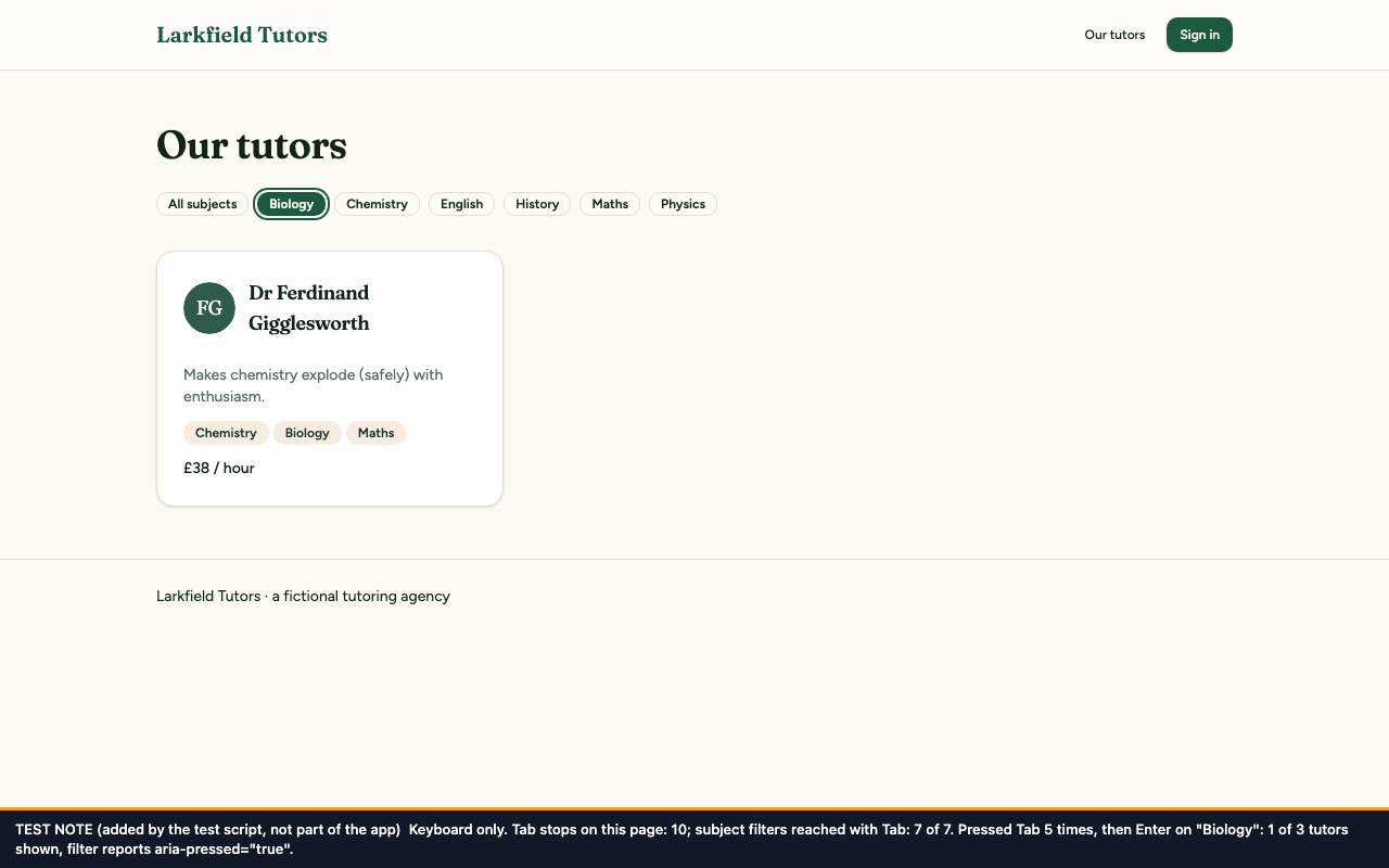
Before, Tab stops at 3 places, all in the header, and reaches 0 of 7 filters; after, Tab reaches 7 of 7, a focus ring shows on the chosen filter, and pressing Enter on "Biology" cut the list from 3 tutors to 1.
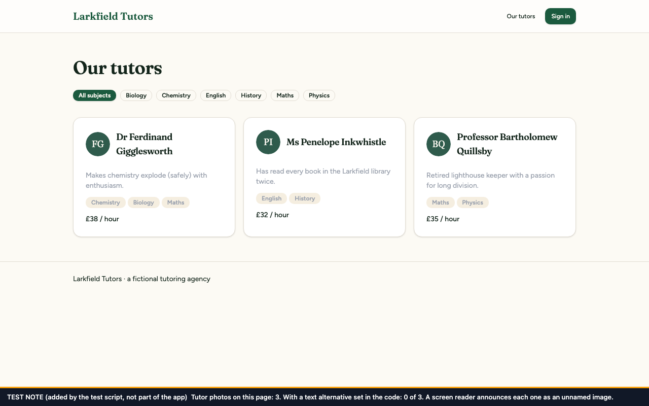
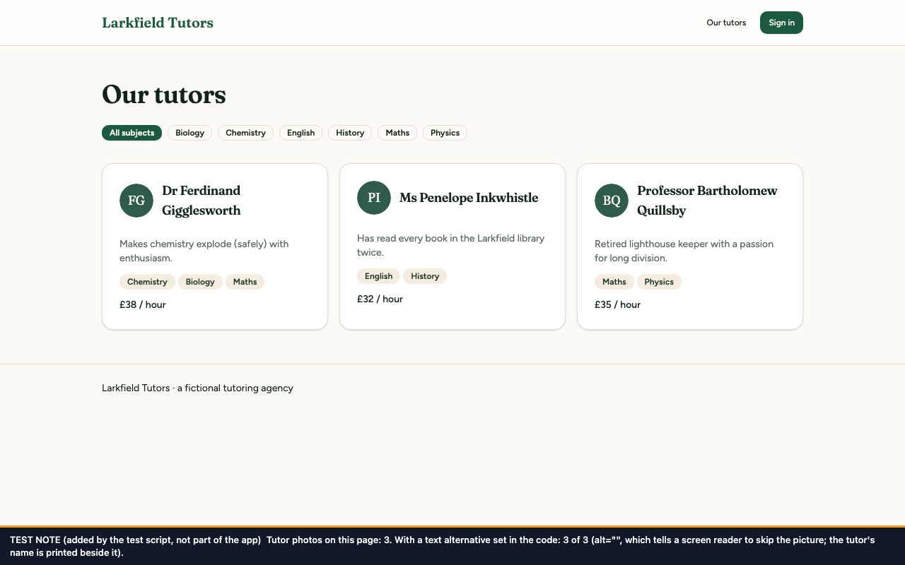
Each tutor's initials picture now carries an empty text alternative. That is the correct value here: the picture only repeats the initials of the name printed beside it, so a screen reader should skip it, not describe it.
src/test/a11y/tutor-photos.test.tsx, 1 test. It checks every tutor photo has a text alternative, that it is empty, and that nothing on the page is announced as an image.
Before the fix: 1 of 1 failed: the photos had no alt attribute.
After the fix: 1 of 1 passed.
Before and after
Before
After
The photos look the same in both; the note counts 0 of 3 photos with a text alternative before and 3 of 3 after. (The darker grey text in the after picture is fix 5.)
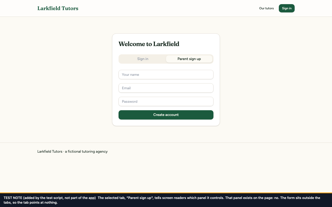
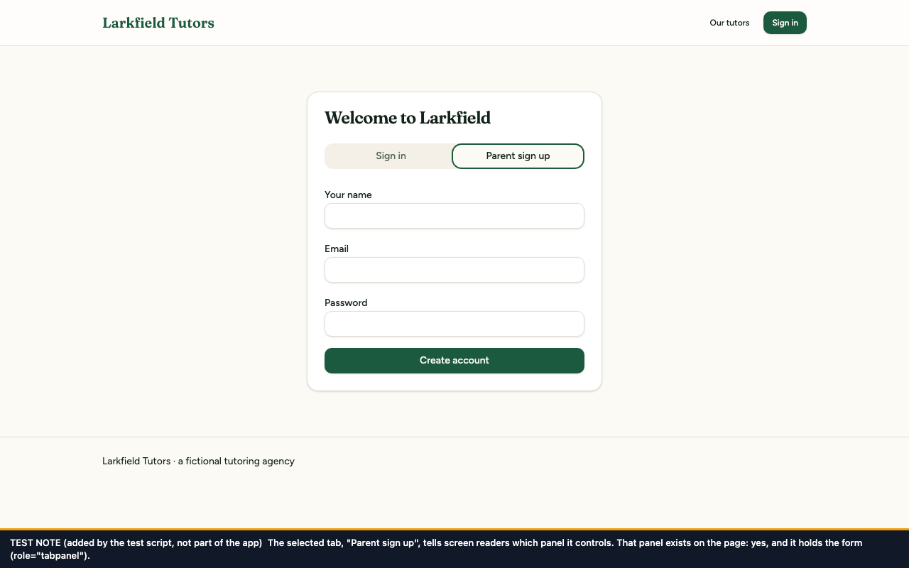
The form now sits inside the panel that belongs to the selected tab, so the tab's pointer leads to something real. Nothing changes on screen. The many moved lines in the diff below are the same form, shifted two spaces to the right.
Not shown: 2 more hunks of this commit, in src/routes/auth.tsx.
The test
src/test/a11y/sign-up-structure.test.tsx, 2 tests. For both tabs it follows the selected tab's pointer and checks it leads to a tab panel that exists and holds the form.
Before the fix: 2 of 2 failed: the panel the tab pointed to did not exist ("expected null not to be null").
After the fix: 2 of 2 passed.
Before and after
Before
After
The page looks the same in both apart from the field labels (fix 1) and the darker tab text (fix 5); the note shows the selected tab's panel did not exist before and exists and holds the form after.
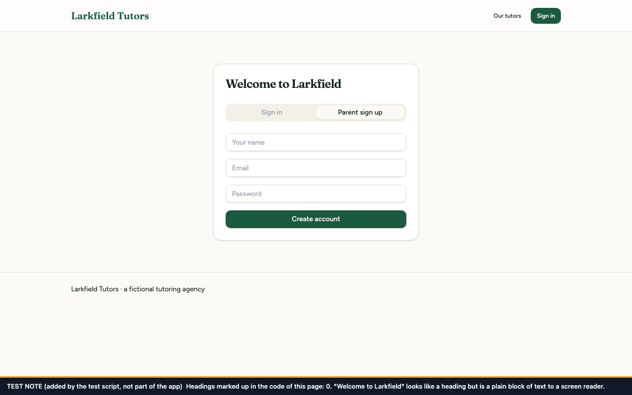
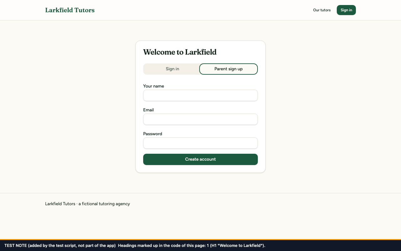
"Welcome to Larkfield" is now marked up as the page's main heading. It looks exactly as it did.
The code change
--- a/src/routes/auth.tsx
+++ b/src/routes/auth.tsx
@@ -77,5 +77,6 @@ function AuthPage() {
<Card>
<CardHeader>
-removed <CardTitle className="font-display text-2xl">Welcome to Larkfield</CardTitle>
+added {/* The page's main heading: a real <h1>, styled exactly as the card title was. */}
+added <h1 className="font-display text-2xl font-semibold leading-none tracking-tight">Welcome to Larkfield</h1>
</CardHeader>
<CardContent>
Not shown: 1 more hunk of this commit, in src/routes/auth.tsx.
The test
src/test/a11y/sign-up-structure.test.tsx (the heading test), 1 test. It checks the page has exactly one main heading and that it reads "Welcome to Larkfield".
Before the fix: 1 of 1 failed: "Unable to find an accessible element with the role 'heading'".
After the fix: 1 of 1 passed.
Before and after
Before
After
The page looks the same in both apart from the field labels (fix 1); the note counts 0 headings before and 1 after (H1 "Welcome to Larkfield").
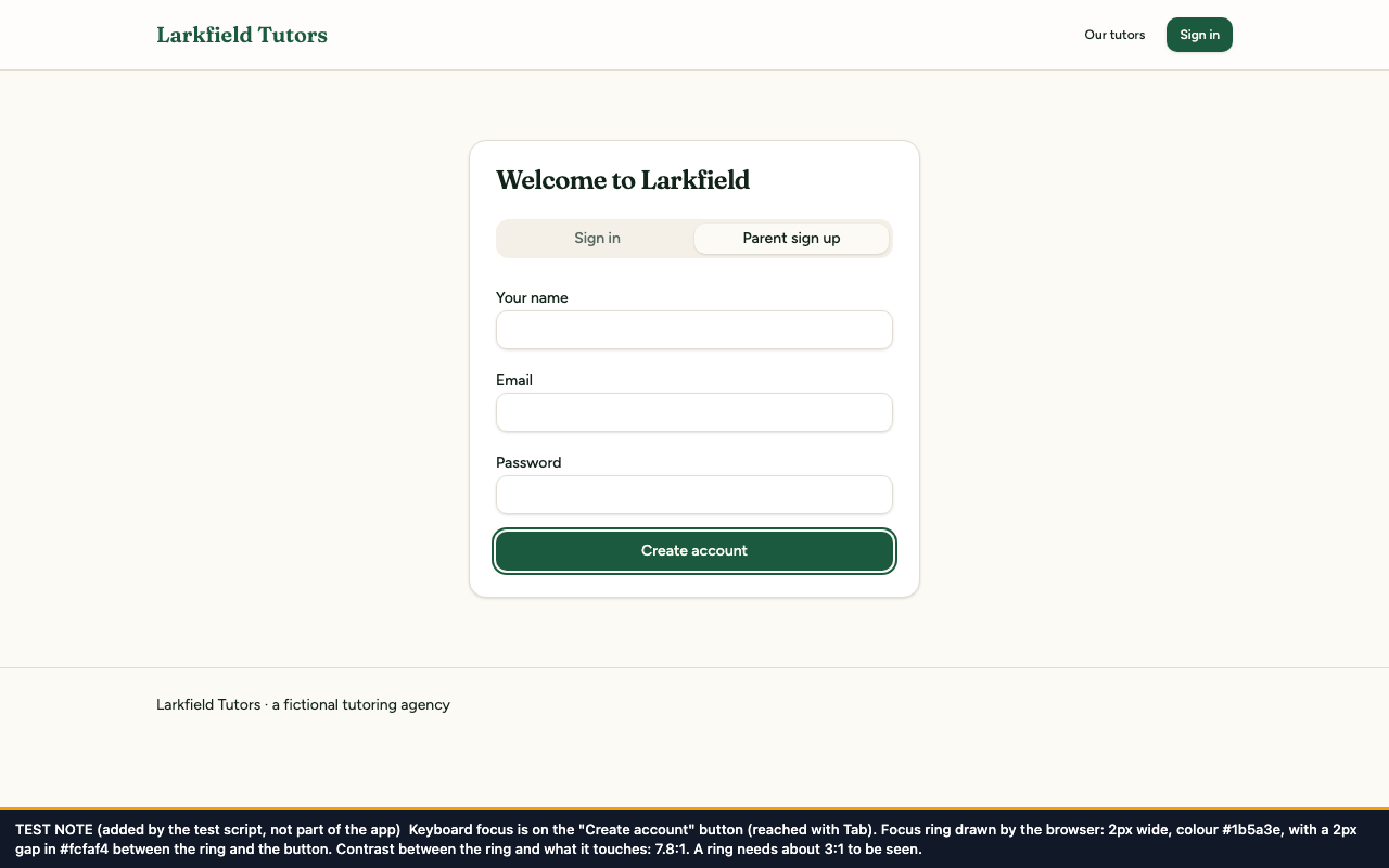
The shared button now draws its focus ring 2 pixels wide, with a 2-pixel gap in the page's background colour between the ring and the button. The gap is what makes the ring visible on a green button: the ring is the same green, so it has to stand apart from the button to be seen. Every kind of button gets the same ring, which also makes it clearer on the pale buttons.
The code change
--- a/src/components/ui/button.tsx
+++ b/src/components/ui/button.tsx
@@ -5,6 +5,8 @@ import { cva, type VariantProps } from "class-variance-authority";
import { cn } from "@/lib/utils";
+added // Focus ring: 2px, with a 2px gap in the page background between it and the button. The ring is the
+added // same green as a solid button, so without the gap it could not be seen (WCAG 2.4.7).
src/test/a11y/focus-ring.test.tsx, 6 tests. For each solid kind of button it works out what the ring touches and requires a contrast of at least 3:1 with it and a width of at least 2 pixels. It also checks the ring against the page and card backgrounds, and that a real button carries the ring.
Before the fix: 4 of 6 failed: on the green button the ring's contrast with what it touched was 1 (the test asks for 3), on the red button 1.70, and the ring was 1 pixel wide. The other two check the ring against the surfaces round a button; they passed before and after.
After the fix: 6 of 6 passed.
Before and after
Before
After
Both show the sign-up form with keyboard focus on "Create account". Before, nothing shows it: the ring is 1 pixel of #1b5a3e touching a #1b5a3e button, contrast 1.00:1. After, a ring stands clear of the button: 2 pixels wide with a 2-pixel gap, contrast 7.80:1. (The after picture also shows the labels from fix 1.)
The shared card title is now a real heading, one level below the page's main heading. It looks as it did. Because the change is in the shared piece, every card on the parent dashboard and the tutor directory is covered at once, and so are the cards on the tutor's own dashboard, which was not tested.
src/test/a11y/card-headings.test.tsx, 2 tests. On the parent dashboard and on the tutor directory it lists the headings and requires one main heading, then each card's title as a level-2 heading, in order.
Before the fix: 2 of 2 failed: "Unable to find an accessible element with the role 'heading'" at level 2.
After the fix: 2 of 2 passed.
Before and after
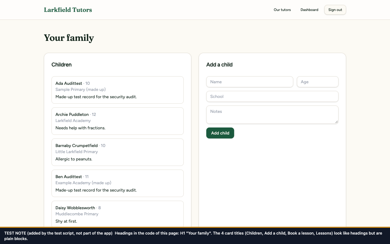
Before
After
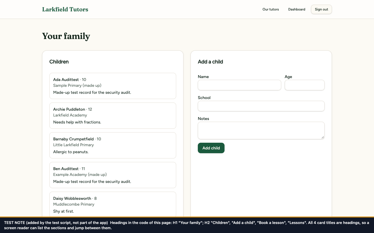
The dashboard looks the same in both apart from the darker grey text (fix 5). The note lists the headings in the code: before, only H1 "Your family"; after, also H2 "Children", "Add a child", "Book a lesson", "Lessons".
Before
After
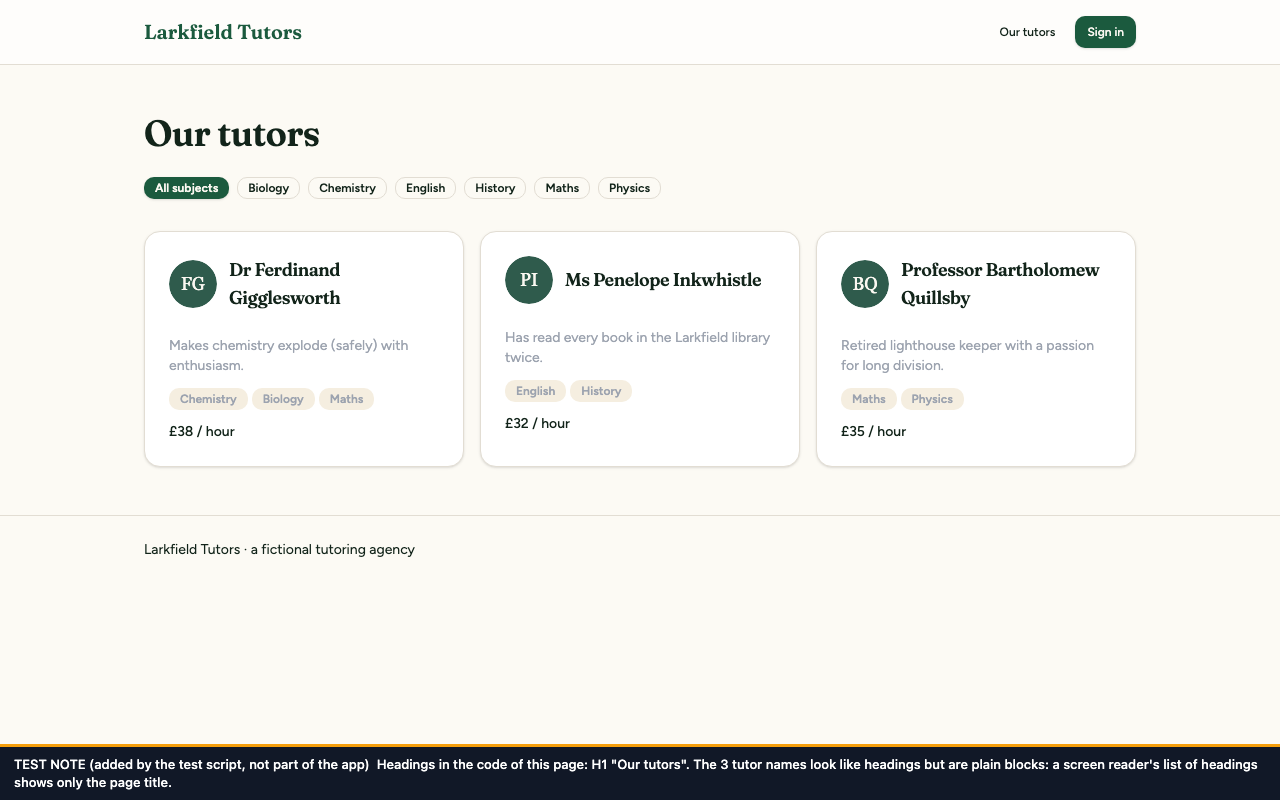
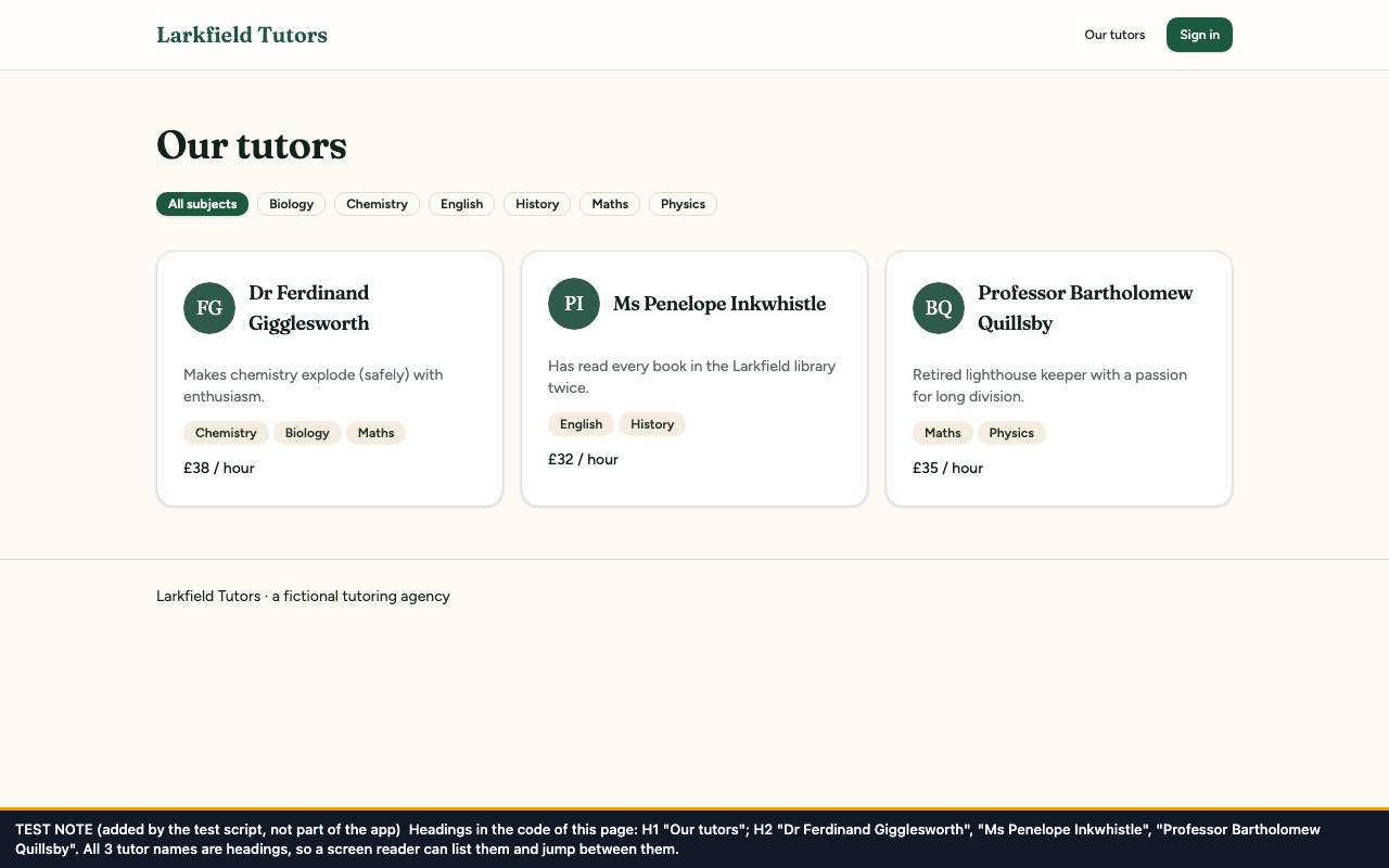
The directory looks the same in both apart from the darker text (fix 5). Before, the only heading is H1 "Our tutors"; after, each tutor's name is an H2: "Dr Ferdinand Gigglesworth", "Ms Penelope Inkwhistle", "Professor Bartholomew Quillsby".
Each field now carries the hint that tells a browser what it asks for: a name, an email address, and a new password on sign-up or the current password on sign-in. Nothing changes on screen. The add-a-child fields are left without a hint on purpose: they ask about the child, not about the person filling in the form, and a browser should not offer the parent's own details there.
src/test/a11y/input-purpose.test.tsx, 2 tests. It checks the hint on each field of the sign-up form and of the sign-in form.
Before the fix: 2 of 2 failed: the fields had no autocomplete attribute.
After the fix: 2 of 2 passed.
Before and after
Before
After
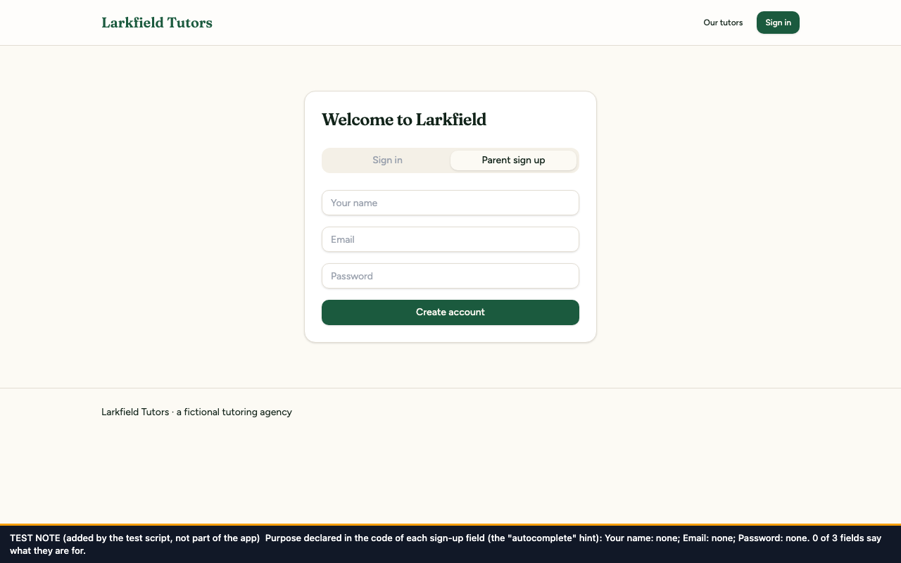
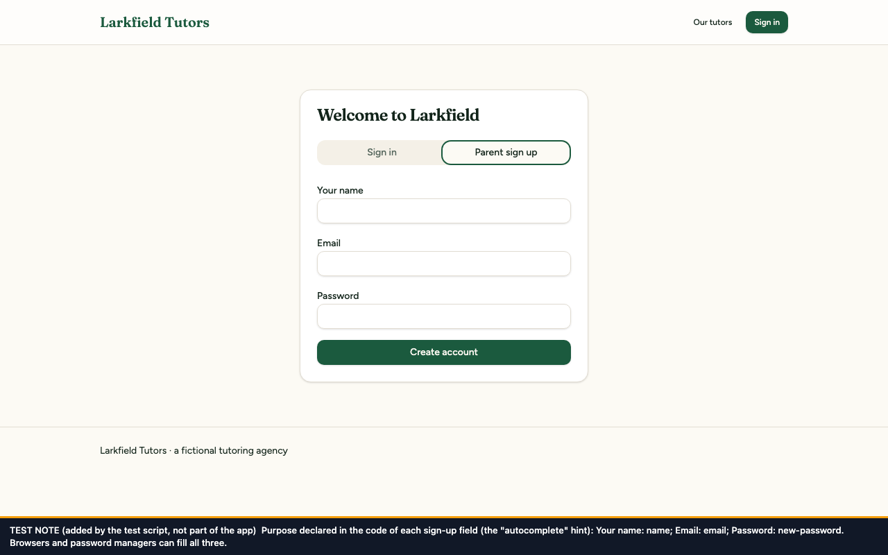
The form looks the same in both apart from the labels (fix 1). The note lists each field's hint: before, Your name: none; Email: none; Password: none; after, Your name: name; Email: email; Password: new-password.
The booking form now works out which fields are empty and names them, using the names printed above the fields. One empty field gives "Please fill in this field: Time." Several give, for example, "Please fill in these fields: Subject, Date and Time." When no subject has been chosen the message names Subject and not Tutor, because the Tutor list fills itself once a subject is chosen. On sign-up and sign-in, the messages for an email address, password or name that is too long now start with the field's name, for example "Email is too long (255 characters at most)". "Invalid email" already named its field and is unchanged. All of these messages are still announced as alerts, as fixed under F15.
The code change
--- a/src/components/views/parent-view.tsx
+++ b/src/components/views/parent-view.tsx
@@ -18,6 +18,22 @@ import { sendLessonReminder } from "@/lib/sms";
+added email: z.string().trim().email("Invalid email").max(255, "Email is too long (255 characters at most)"),
+added password: z
+added .string()
+added .min(8, "Password must be at least 8 characters")
+added .max(72, "Password is too long (72 characters at most)"),
+added fullName: z.string().trim().max(100, "Your name is too long (100 characters at most)").optional(),
});
The test
src/test/a11y/error-identification.test.tsx, 5 tests. It leaves only Time empty and expects the message to name Time; leaves several fields empty and expects each to be named, by a name that is also a label on the form; and checks that the sign-up messages for an over-long email address and password start with the field's name. Two expectations in the F15 test (form-errors.test.tsx) were updated to the new words.
Before the fix: 4 of 5 failed: the booking message was "Please fill in every field" both times, and the over-long email address and password gave "String must contain at most 255 character(s)" and "String must contain at most 72 character(s)". The fifth test covers "Invalid email", which was already right.
After the fix: 5 of 5 passed.
Before and after
Before
After
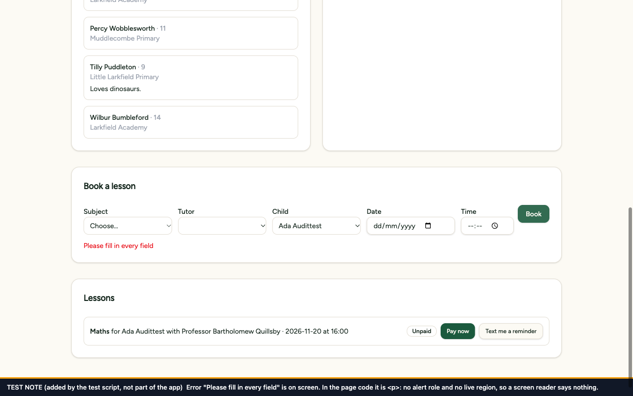
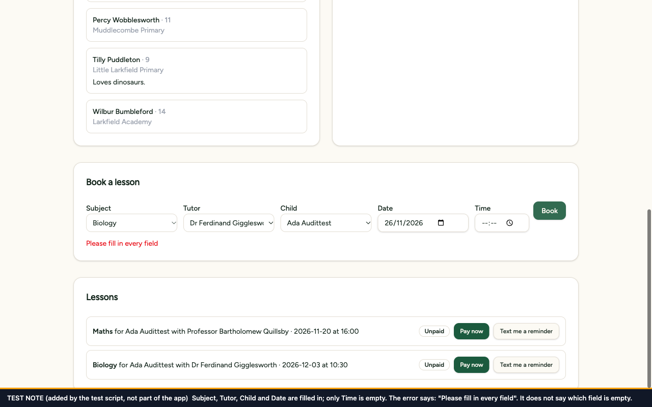
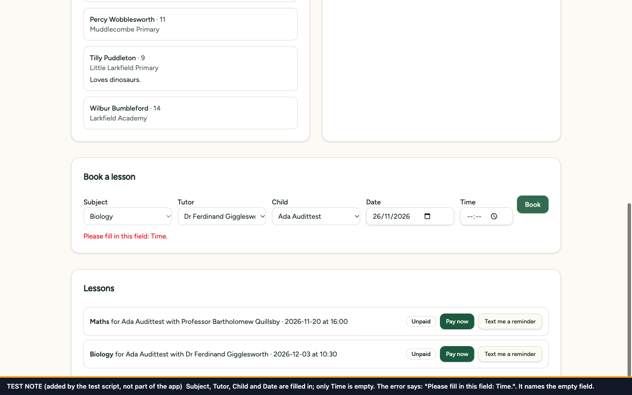
Both show the booking form with only Time left empty. Before, the message is "Please fill in every field", which does not say what is missing; after, it is "Please fill in this field: Time."
Before
After
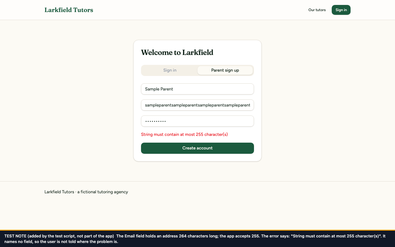
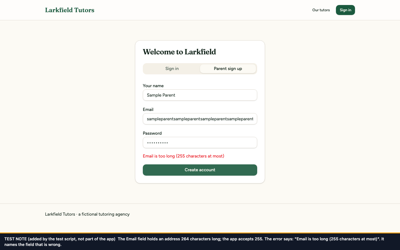
Both show the sign-up form with an email address of 264 characters. Before, the message is "String must contain at most 255 character(s)"; after, it is "Email is too long (255 characters at most)".
The automated checker, before and after
axe-core was run with its default rules (version 4.14.0, in Chromium 158, window 1280 × 800) on eight page states: six screens and states of the app, plus the two error states, because finding F15 is about error messages. The «after» scans were run on the final code, with all 13 fixes in place.
A violation is a rule that failed. The count of elements is how many things on the page failed it. An element that fails on a page is counted once for every scan of that page, so the same fault on the dashboard appears in each of the dashboard's scans.
Checker results by screen
Screen
Before: violations
After: violations
Rules that passed, before → after
Sign-up
3 rules, 3 elements
0
36 → 41
Add a child (parent dashboard as loaded)
3 rules, 25 elements
0
32 → 34
Tutor directory
2 rules, 13 elements
0
29 → 36
Book a lesson (form filled in)
3 rules, 25 elements
0
32 → 34
Book a lesson, date and time picker open
3 rules, 25 elements
0
32 → 34
Book a lesson, confirmation dialog open
1 rule, 20 elements
0
30 → 30
Extra state: sign-up with its error shown
3 rules, 3 elements
0
36 → 41
Extra state: book a lesson with its error shown
3 rules, 25 elements
0
32 → 38
All eight scans
6 different rules, 139 elements
0 rules, 0 elements
—
"Add a child" and "Book a lesson" are on the same page, the parent dashboard, so each of those scans covers the whole page in the state named.
Checker results by rule
axe-core rule
What the rule requires
WCAG 2.1
Severity (axe)
Before: elements
After: elements
Finding
Fixed by
color-contrast
Text must have enough contrast with its background
Failing elements by rule and screen, before → after
axe-core rule
Sign-up
Add a child
Tutor directory
Book a lesson
Book a lesson, date and time picker open
Book a lesson, confirmation dialog open
sign-up with its error shown
book a lesson with its error shown
color-contrast
1 → 0
20 → 0
10 → 0
20 → 0
20 → 0
20 → 0
1 → 0
20 → 0
select-name
0 → 0
3 → 0
0 → 0
3 → 0
3 → 0
0 → 0
0 → 0
3 → 0
label
0 → 0
2 → 0
0 → 0
2 → 0
2 → 0
0 → 0
0 → 0
2 → 0
image-alt
0 → 0
0 → 0
3 → 0
0 → 0
0 → 0
0 → 0
0 → 0
0 → 0
aria-valid-attr-value
1 → 0
0 → 0
0 → 0
0 → 0
0 → 0
0 → 0
1 → 0
0 → 0
page-has-heading-one
1 → 0
0 → 0
0 → 0
0 → 0
0 → 0
0 → 0
1 → 0
0 → 0
What axe-core cannot see
Five of the eight audit findings are invisible to it: F5 (keyboard trap), F11 (hints used as labels), F14 (focus after the dialog), F15 (silent errors) and F16 (mouse-only filters). So are the four found during the work: E3 (focus ring), E4 (card titles), E5 (purpose of fields) and E6 (which field an error is about). None of these appears in the counts above, before or after. Their evidence is the tests and the measured checks under each fix.
Checks it could not decide. axe-core marks a check "incomplete" when it cannot decide by itself and a person should look. Before: 5 elements. After: 5. These are not violations. They were the same five elements both times, all on the scan with the confirmation dialog open. Four are parts of the page hidden behind the dialog, where axe-core asks a person to confirm that Tab cannot reach them. One is the dialog's summary sentence, whose background axe-core could not work out. Both were checked on the final code: 16 presses of Tab and Shift+Tab went round Cancel, Confirm booking and Close and never left the dialog, and the sentence measures #57685e on #fcfaf4 = 5.67:1.
The browser's calendar pop-up is drawn by the browser, outside the page, so axe-core cannot inspect inside it. The scan "date and time picker open" covers the page while the calendar is open.
Each finding and its criterion
Each finding, the WCAG 2.1 criterion it falls under, the fix that deals with it, and the evidence.
1.3.1 Info and Relationships (Level A). axe-core files this rule under "best practice", not under a WCAG criterion. 1.3.1 is the criterion that applies here, because text that looks like a heading is not marked up as one
2.4.7 Focus Visible (Level AA). WCAG 2.1 sets no minimum contrast between a focus ring and the button it surrounds; the 3:1 used in the test is borrowed from 1.4.11 Non-text Contrast (Level AA), which asks it of a ring against the background behind it.
Test src/test/a11y/error-identification.test.tsx; pictures E6-booking-error-names-field; pictures E6-sign-up-error-names-field
The criteria are FluxForge's reading of WCAG 2.1. The independent auditor confirms them.
Re-test checklist
This is the checklist an auditor would be handed for a re-test by hand, criterion by criterion. Larkfield Tutors is not published, so it is shown as an example of what is handed over.
It asks for a current browser on a computer with a keyboard and, for the screen-reader checks, VoiceOver (Mac) or NVDA (Windows). Screen readers word things differently, so the quoted phrases are approximate: what matters is that the name, the kind of control and its state are all spoken.
The parent screens need a parent account. Checks marked (saves data) store something.
2.1.2 No Keyboard Trap (F5): booking date and time
Keyboard path. Sign in as a parent. On the dashboard, Tab to "Subject" in "Book a lesson" and choose a subject. Tab on through Tutor, Child, Date and Time. Date and Time take one press of Tab for each of their parts: in Chrome that is day, month, year and the calendar button, then hours, minutes and the clock button. Expected: focus then reaches the Book button, and the next Tab moves on into the lessons list. Measured after the fix, starting in the Date field: Date field → Date field → Date field → Time field → Time field → Time field → "Book" button (7 presses).
Backwards. With focus in the Date field, Shift+Tab must go back to the Child field. Measured after the fix: the Child field.
Escape. Open the calendar from the Date field (in Chrome: Space, F4 or Alt+Down arrow), then press Escape. Expected: the calendar closes and focus stays in the Date field. This also worked before the fix, because the browser handles the key itself while its calendar is open; see the limits at the end of this page.
Screen reader. Should announce "Date" and "Time" with the kind of field as focus enters each, and "Book, button" after them.
Contrast. Nothing to measure for this criterion.
3.3.2 Labels or Instructions and 1.3.1 Info and Relationships (F11): sign-up and add a child
Keyboard path. Open /auth. Tab to the tabs and press Right arrow to choose "Parent sign up". Tab through Your name, Email, Password and "Create account", typing something in each field. Expected: each field's name is printed above it and stays there while you type. Repeat on the dashboard's "Add a child" form: Name, Age, School, Notes.
Mouse. Click each name. Expected: the cursor goes into that name's field.
Screen reader. Should announce "Your name, edit text", "Email, edit text", "Password, secure edit text"; then on the dashboard "Name, edit text", "Age" as a number field, "School, edit text" and "Notes" as a multi-line field.
Contrast to measure. Label text: #12241a on #ffffff = 16.24:1. Required: 4.5:1.
1.3.1 Info and Relationships and 4.1.2 Name, Role, Value (F12): booking form
Keyboard path. Tab through Subject, Tutor, Child, Date and Time in "Book a lesson".
Mouse. Click each of the five names. Expected: focus moves to that name's field every time.
Screen reader. Should announce each field with its name: "Subject", "Tutor" and "Child" as pop-up lists, "Date" as a date field, "Time" as a time field. Fail if any is announced with no name.
Contrast to measure. Label text: #12241a on #ffffff = 16.24:1. Required: 4.5:1.
1.4.3 Contrast (Minimum) (F13): helper text and subject tags
Measure with a contrast checker, such as the colour picker in the browser's developer tools. All of these need at least 4.5:1.
Where
Before
Measured after the fix (text on background)
Tutor directory: tutor descriptions
2.54:1
#57685e on #ffffff = 5.92:1
Tutor directory: subject tags
2.20:1
#1b3427 on #f5eee0 = 11.61:1
Parent dashboard: the grey line under each child's name
2.54:1
#57685e on #ffffff = 5.92:1
Sign-up page: the tab that is not selected
2.23:1
#57685e on #f4f0e7 = 5.21:1
Booking confirmation: the sentence that sums up the booking
not measured
#57685e on #fcfaf4 = 5.67:1
Tutor directory: a filter that is on
not a fault
#fbf8f1 on #1b5a3e = 7.68:1
Tutor directory: a filter that is off
not a fault
#12241a on #fcfaf4 = 15.56:1
Sign-up and booking: red error text
not a fault
#e7000b on #ffffff = 4.77:1
The helper-text colour also has to pass on backgrounds that did not come up on these screens. Calculated from the app's colour settings, by the same method as the automated test: 5.68:1 on the page background #fdfaf4, 5.92:1 on white cards, 5.21:1 on the tab strip #f4f0e7 and 5.13:1 on tag backgrounds #f5eee0.
Keyboard path and screen reader. Nothing to check for this criterion.
2.4.3 Focus Order (F14): closing the booking confirmation
Keyboard path. Fill in the booking form, Tab to Book and press Enter. The dialog opens; measured after the fix, focus starts on the "Cancel" button. Then close it three ways:
Press Enter on Cancel. Expected: focus is on the Book button. Measured: the "Book" button.
Open it again and press Escape. Expected: focus is on the Book button. Measured: the "Book" button.
Open it again, Tab to "Confirm booking" and press Enter (saves data). Expected: focus is on the Book button when the dialog closes and after the save. Measured with one real save: the "Book" button, then the "Book" button.
Seeing it. A ring is drawn round the Book button while it has focus (E3).
Screen reader. On opening should announce "Confirm your booking, dialog" and the sentence that sums up the booking. On closing should announce "Book, button".
Contrast. Nothing to measure for this criterion.
4.1.3 Status Messages (F15): sign-up and booking errors
Keyboard path, sign-up. On "Parent sign up", type a name, an email address with no ending such as name@example, and eight or more characters as a password. Press Enter. Expected: "Invalid email" appears in red above the button. Nothing is sent.
Keyboard path, booking. With the booking form empty, Tab to Book and press Enter. Expected: "Please fill in these fields: Subject, Date and Time." appears in red under the form.
Screen reader. Should speak the error text as soon as it appears, without focus moving. Make the same mistake again: it should be spoken again.
Not this check. If a required sign-up field is empty, the browser shows its own "fill in this field" bubble and announces it itself. That message is the browser's, not the app's.
Contrast to measure. Red error text: #e7000b on #ffffff = 4.77:1 on sign-up, #e7000b on #ffffff = 4.77:1 on booking. Required: 4.5:1.
2.1.1 Keyboard (F16): subject filters
Keyboard path. Open /tutors signed out and press Tab repeatedly. Expected: after the three header links, focus visits every filter in turn, with a ring drawn round the one that has focus. Measured after the fix: 10 Tab stops, 7 of 7 filters reached. Press Enter or Space on a subject. Expected: only tutors who teach it are listed. "All subjects" brings everyone back.
Screen reader. Should announce "Filter tutors by subject, group" on entering the row, then each filter as a toggle button with its state: "All subjects" as pressed (some screen readers say "selected"), the others as not pressed. After pressing one, its state should change to pressed.
Contrast to measure. The focus ring is the app's dark green, #1b5a3e: 7.82:1 against the page background #fdfaf4, calculated from the colour settings. 1.4.11 asks 3:1 of a focus ring against the background behind it.
1.1.1 Non-text Content (F19): tutor photos
Keyboard path. Nothing to check: the photos cannot take focus.
Screen reader. Read through a tutor card. Expected: you hear the tutor's name, description, subjects and rate, and no "image". In the screen reader's list of images, the tutor photos do not appear.
Contrast. Nothing to measure for this criterion.
4.1.2 Name, Role, Value (E1): sign-in and sign-up tabs
Keyboard path. Open /auth. Tab to the tabs. Left and Right arrows switch between "Sign in" and "Parent sign up". Tab moves from the tabs straight into the form's first field.
Screen reader. Should announce "Sign in, tab, selected, 1 of 2" and "Parent sign up, tab, 2 of 2". Moving into the form should announce "Parent sign up, tab panel" (or "Sign in, tab panel").
Contrast. The unselected tab is in the table under 1.4.3 above.
1.3.1 Info and Relationships (E2): sign-up page heading
Keyboard path. Nothing to check.
Screen reader. Open the list of headings. Expected: it shows "Welcome to Larkfield, heading level 1". The key for "next heading" lands on it.
Contrast. Nothing to measure for this criterion.
2.4.7 Focus Visible and 1.4.11 Non-text Contrast (E3): focus ring on buttons
Keyboard path. On "Parent sign up", Tab to "Create account". Signed in as a parent, Tab to "Add child", "Book" and "Pay now". Signed out, Tab to "Sign in" in the header. Expected: while a button has focus, a dark green ring is drawn round it, with a thin gap between ring and button.
Screen reader. Nothing to hear: this check is for the eye.
Contrast to measure. The ring against the gap it touches, which is in the page's background colour. Measured after the fix on "Create account": ring #1b5a3e, 2 pixels wide, with a 2-pixel gap in #fcfaf4, contrast 7.80:1; 1.4.11 asks for 3:1. Before the fix the ring touched the button itself, in the same green: 1.00:1.
1.3.1 Info and Relationships (E4): card titles
Keyboard path. Nothing to check.
Screen reader. Open the list of headings. Expected on the parent dashboard: "Your family" at level 1, then "Children", "Add a child", "Book a lesson" and "Lessons" at level 2. Expected on the tutor directory: "Our tutors" at level 1, then each tutor's name at level 2. The key for "next heading" moves from card to card.
Contrast. Nothing to measure for this criterion.
1.3.5 Identify Input Purpose (E5): sign-up and sign-in fields
Keyboard path. On "Parent sign up", put the cursor in Your name, then Email, then Password. Expected: a browser that has your details saved offers to fill them in, and offers a new password in the Password field. What is offered depends on the browser and what it has saved.
Check in the code. If the browser offers nothing, open its developer tools and look at each field. Expected:autocomplete reads name, email and new-password on sign-up, and email and current-password on sign-in. Measured after the fix: Your name: name; Email: email; Password: new-password.
Screen reader and contrast. Nothing to check for this criterion.
3.3.1 Error Identification (E6): errors name the field
Keyboard path, booking. In "Book a lesson" choose a subject and type a date, leave Time empty, then press Enter on Book. Expected: the message reads "Please fill in this field: Time." With the whole form empty it reads "Please fill in these fields: Subject, Date and Time." The names in the message are the names printed above the fields.
Keyboard path, sign-up. Paste an email address longer than 255 characters into Email, type eight characters as a password and press Enter. Expected: the message reads "Email is too long (255 characters at most)". Nothing is sent.
Screen reader. Should speak the whole message, field names included, as soon as it appears.
Contrast. The red text is measured under 4.1.3 above.
Limits, and what an auditor would still check
The work was done against WCAG 2.1, levels A and AA, on four screens: sign-up, add a child, the tutor directory and book a lesson.
The screen-reader check by a person. On 12 November 2026 FluxForge's founder, who owns the app, checked the fixed app by ear, following a 24-step script with VoiceOver in Safari on a Mac. All 24 steps were ticked. This was one pass by the app's owner. It is not an independent audit.
What the 24 steps cover:
the listening checks for F5, F11, F12, F14, F15, F16 and F19, and for E1, E2, E4 and E6;
the check by eye that the focus ring shows on «Create account» and «Add child» (E3).
What they do not cover:
F13 (contrast) and E5 (purpose of fields). Neither can be heard; they rest on the measurements under each fix and in the re-test checklist.
Anything that saves. Focus after a real «Confirm booking» was tested once by the script.
The pop-up messages and the other two items listed below for the auditor.
Other screen readers. NVDA and JAWS on Windows, and screen readers on phones, were not used.
The one real booking. All the scans, and every picture but one, were made with saves blocked. Once, between two rounds of pictures, saves were let through for one booking only, made through the form for Parent A's test child; the picture of that booking is the exception. The lessons list went from 1 lesson to 2, and the «Lesson booked» message appeared. Keyboard focus was on the «Book» button when the dialog closed and after the save, which is the result F14 needs. The booking was made one fix before the final code; the fix that came after it, E6, changes only the words of error messages, so the booking was not repeated. The «after» pictures were taken again on the final code, after the booking, which is why they list two lessons.
Limits of this work.
One browser for the automated work. The scans, pictures and measurements were made in Chromium 158 on a Mac. Firefox and phones were not tested.
The calendar pop-up is drawn by the browser, not by the page, so it does not appear in pictures and axe-core cannot inspect it. Escape closed an open calendar before the fix too, because the browser handles the key itself while its calendar is showing. What the planted fault swallowed was Escape with the calendar closed.
Parent and public screens only. The tutor and admin screens were not in scope. Three shared fixes reach them too: the darker helper text, the button focus ring and the card titles. Nothing on those screens was tested.
Not a full audit by hand. The eight audit findings, the two axe-core findings and four faults noticed along the way were fixed. Nobody went through these screens criterion by criterion, so other faults may remain.
Checks on every change. 41 automated tests were added, and every fix has at least one test that failed before the fix and passes after it. The demonstration app has no pipeline that runs them on every change; on a client's product, setting that up is part of the work.
Seen along the way and not changed: for the auditor. These three were seen in the code or on screen. None was tested.
Nothing says which fields must be filled in. On sign-up, Email and Password are required and Your name is not, but the form does not say so; the same goes for the booking form and for Name and Age in «Add a child». WCAG 3.3.2 Labels or Instructions (Level A).
Pop-up messages were not listened to. «Child added», «Lesson booked», «Name is required», sign-in errors and similar messages appear as small pop-up notes and disappear by themselves after a few seconds. The code marks them for screen readers, but nobody heard them spoken. WCAG 4.1.3 Status Messages (Level AA); how long they stay is a question for 2.2.1 Timing Adjustable (Level A).
Buttons in the lessons list share their names. Every lesson has its own «Pay now» and «Text me a reminder» button, and with two lessons there are two of each with identical names. Heard in a list of buttons, nothing says which lesson each belongs to. WCAG 2.4.6 Headings and Labels (Level AA).
Left alone in this work. The audit's security findings, including the planted ones, were left alone in this work: it dealt with accessibility only.
Prepared by FluxForge with Claude Code, 12 November 2026. Sample work on a demonstration app; not an assessment of any real business.